Is comic sans the most unpopular font?
Comic Sans. Mention those two words in a design studio and at best you’d get a huff (an angry sup of tea) or at worst a proper hissy-fit (a full on rant about kerning and ugly descenders), because Comic Sans rankles designers like no other typeface.
Even the comic book artist Dave Gibbons, whose work was one of the inspirations for the font, said it was a mess. Microsoft even released a Comic Sans Pro on April Fools Day 2011 and everyone thought it was a joke. Alas, the only joke was that the pro version cost over £100.
Comic Sans MS was designed by Vincent Connare, and to be fair, his brief was to design a typeface for the Microsoft user and their kids, so he pretty much nailed it. Comic Sans was released in 1994 and supplied with Microsoft Windows 95 in its font pack. The date is quite significant because the mid 90s could be described as the golden age of amateur desktop publishing. When any design-illiterate idiot with a big beige box could claim to be a graphic designer without any actual design skills. And this was the problem with Comic Sans, not the font per se – but rather the hilarious improper use of it.
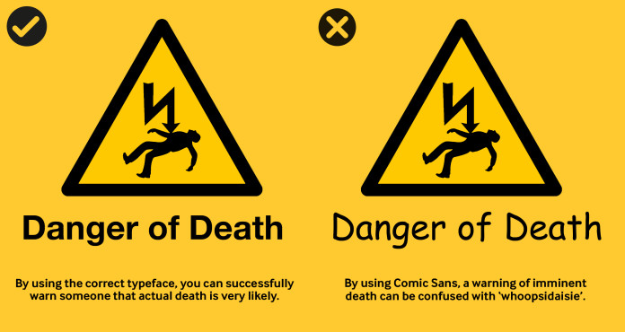
Comic Sans has been described by Microsoft as ‘casual’, ‘fun’, ‘playful’ and has become the go-to font for someone wanting something casual, fun, playful etc. It’s just that most of the time the casual, fun and playful poster was not ‘Come to our lovely garden party and have cake’ but more along the lines of ‘DANGER! DEATH! Don’t touch the dangerous electric fence’.
With the invention of printing, the printed word seemed like magic – ‘a gift from god’ or at least a very complicated and messy process for the average person to understand. Then suddenly affordable technology allowed anybody with a desktop computer and an inkjet printer to typeset their own documents, print and then distribute to their heart’s content. Flooding the world with Comic Sans.
No wonder designers hated it. It stood for everything that belittles what they do – a disposable typeface for disposable design.
But surely it must have a place in the world of design. One could argue that Comic Sans is just as culturally significant as Helvetica – another font overused, but this time by the design community.
There was an actual movement to ban Comic Sans. No other font can claim that! It almost makes it ‘edgy’. Maybe we should all just lighten up a bit and accept it’s in the world. Lurking in our Font Book waiting patiently to become fashionable like a pair of crocs. Maybe one day it might become ‘post-ironically hip’ and then everyone will be claiming they always loved Comic Sans and it will start appearing on vinyl record covers and glossy books.
Until then though, please stop using it on danger signs and on the side of coffins.