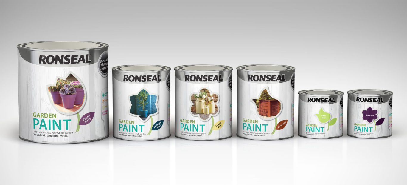
Our innovative redesign has delivered outstanding growth for the Ronseal Garden Paint range.
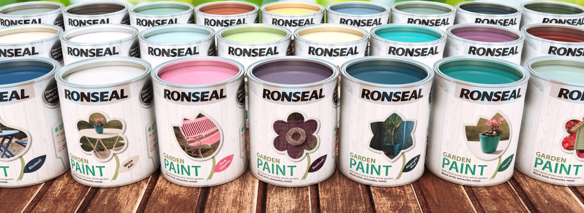
We recognised the need to strengthen the product’s appeal to women in response to consumer insights and buying trends. Building our creative on the latest market intelligence has raised on-shelf presence and dramatically increased sales.
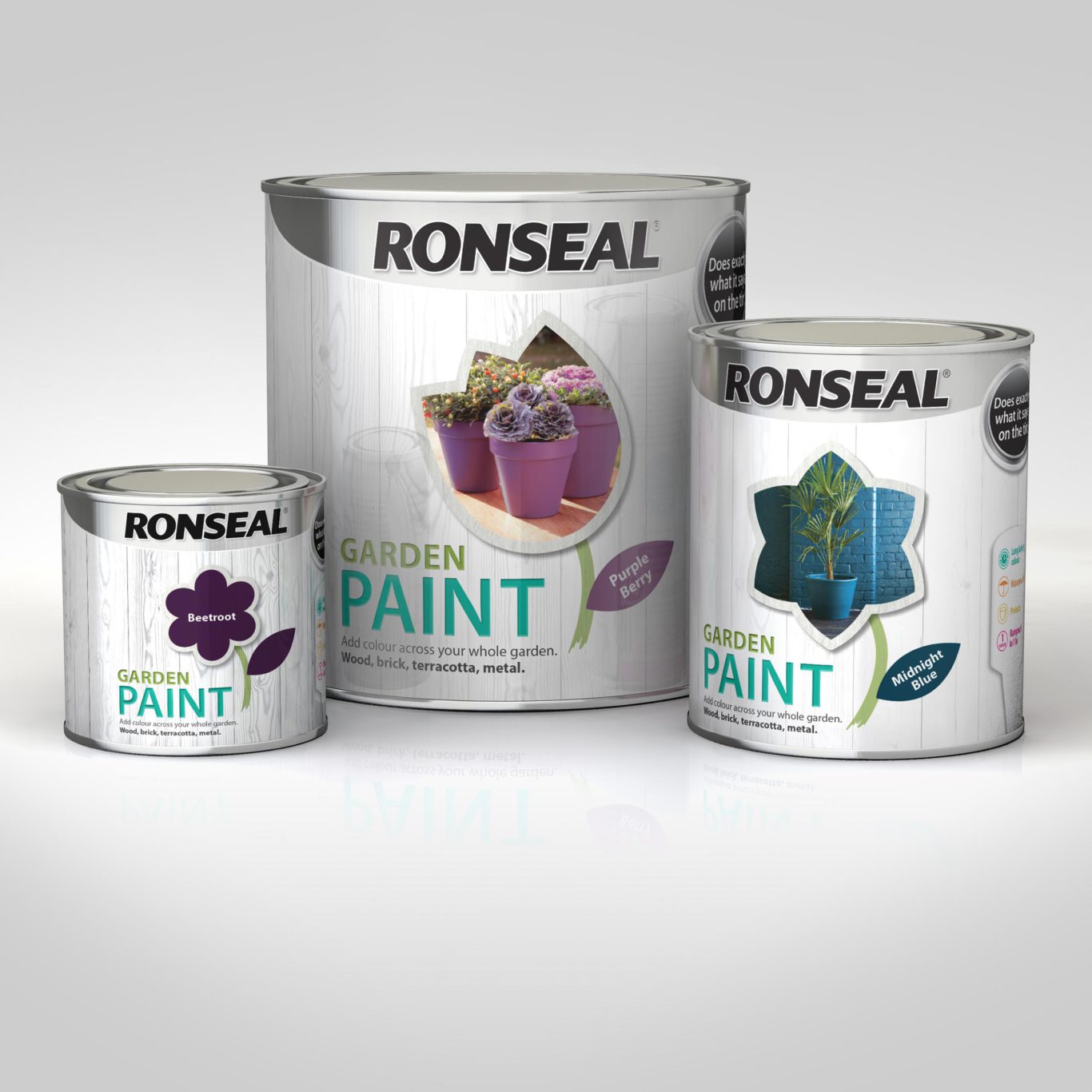
Our new labelling approach gave Ronseal market leading stand-out with on-shelf and sales performance to match, at +59% in its first year.
Redesigned for a new audience
A fresh approach was needed to succeed in the competitive DIY and garden sectors and market research indicated that decision makers for home products were predominantly female, especially when it came to decisions based on colour.
A brand with greater appeal
We developed a strong identity with innovation and personality at its heart. This new look worked harder on shelf and across all the supporting collateral. Packs were more colourful and stylish with lifestyle-led product imagery designed to target a trend-conscious audience.
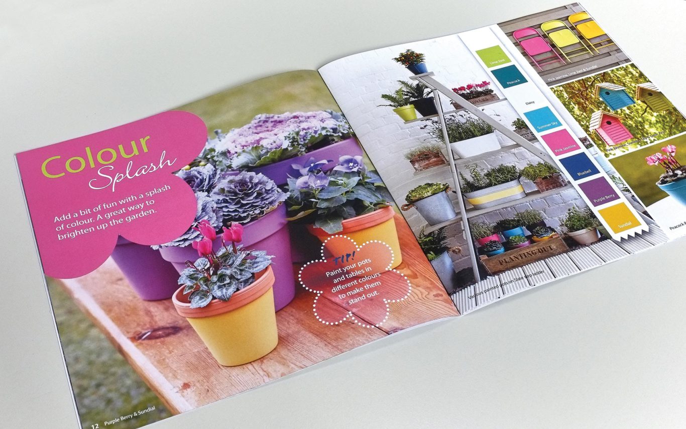
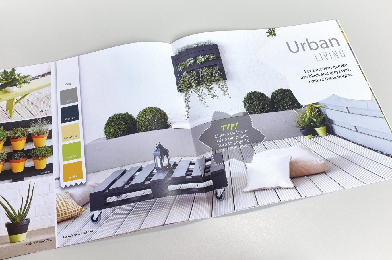
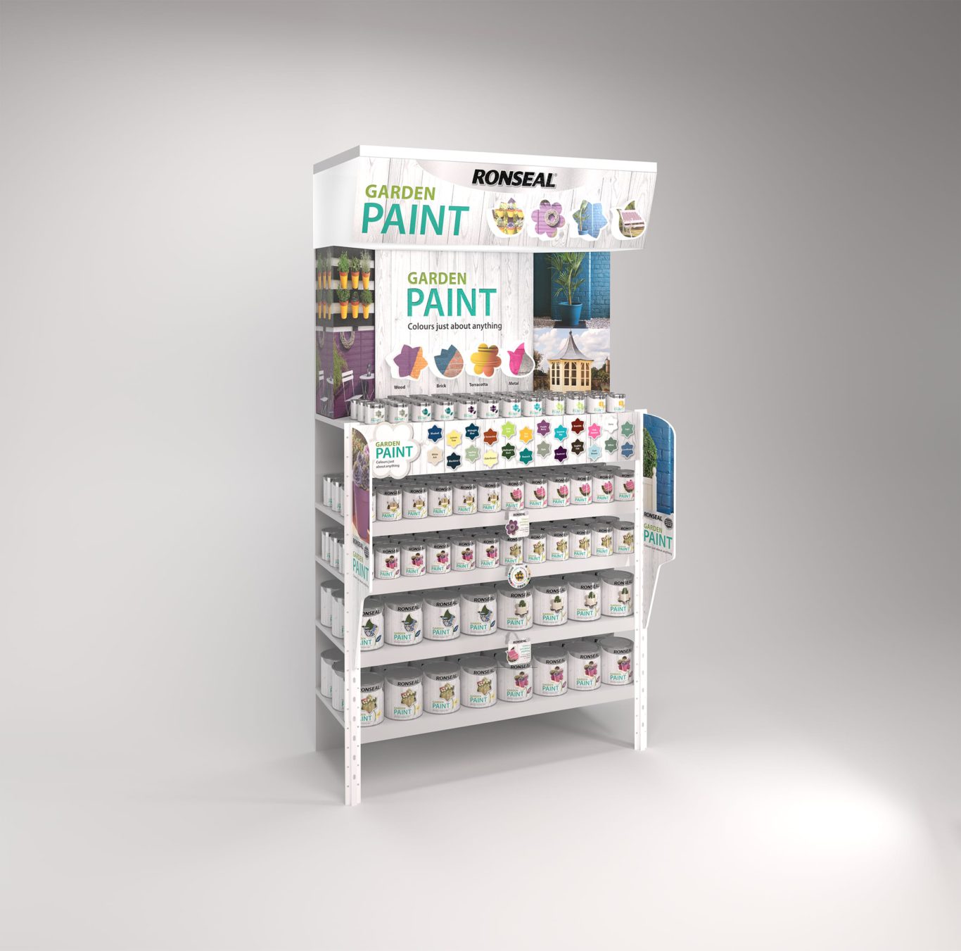
Michon’s redesign of our Garden Paint range and POS has played a massive role in delivering outstanding growth.
Ronseal Marketing director
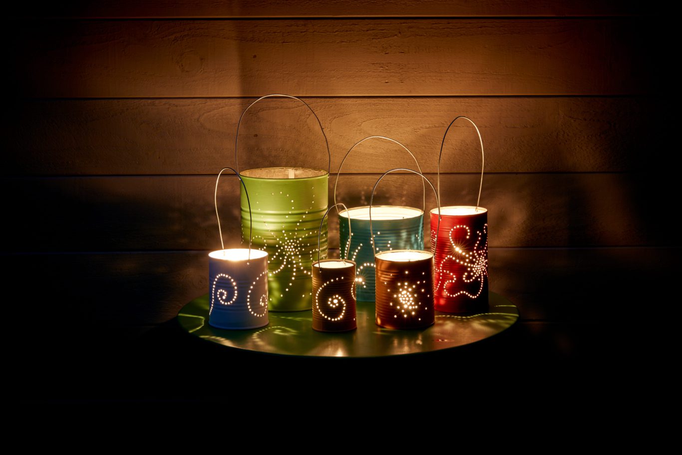
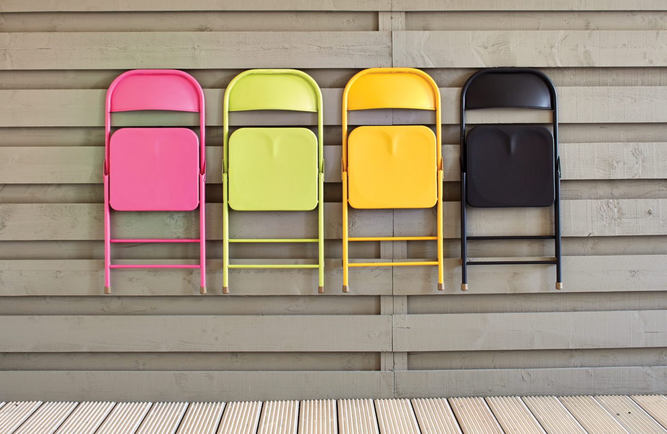
Clever personalisation of each pack
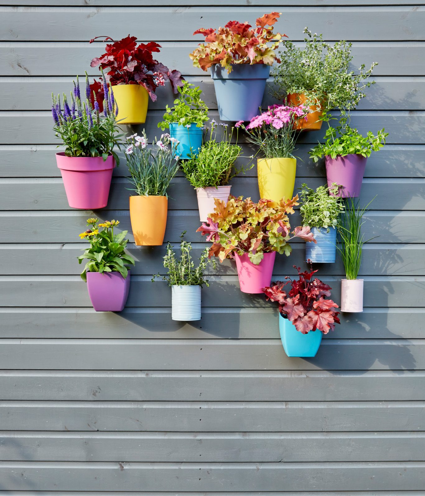
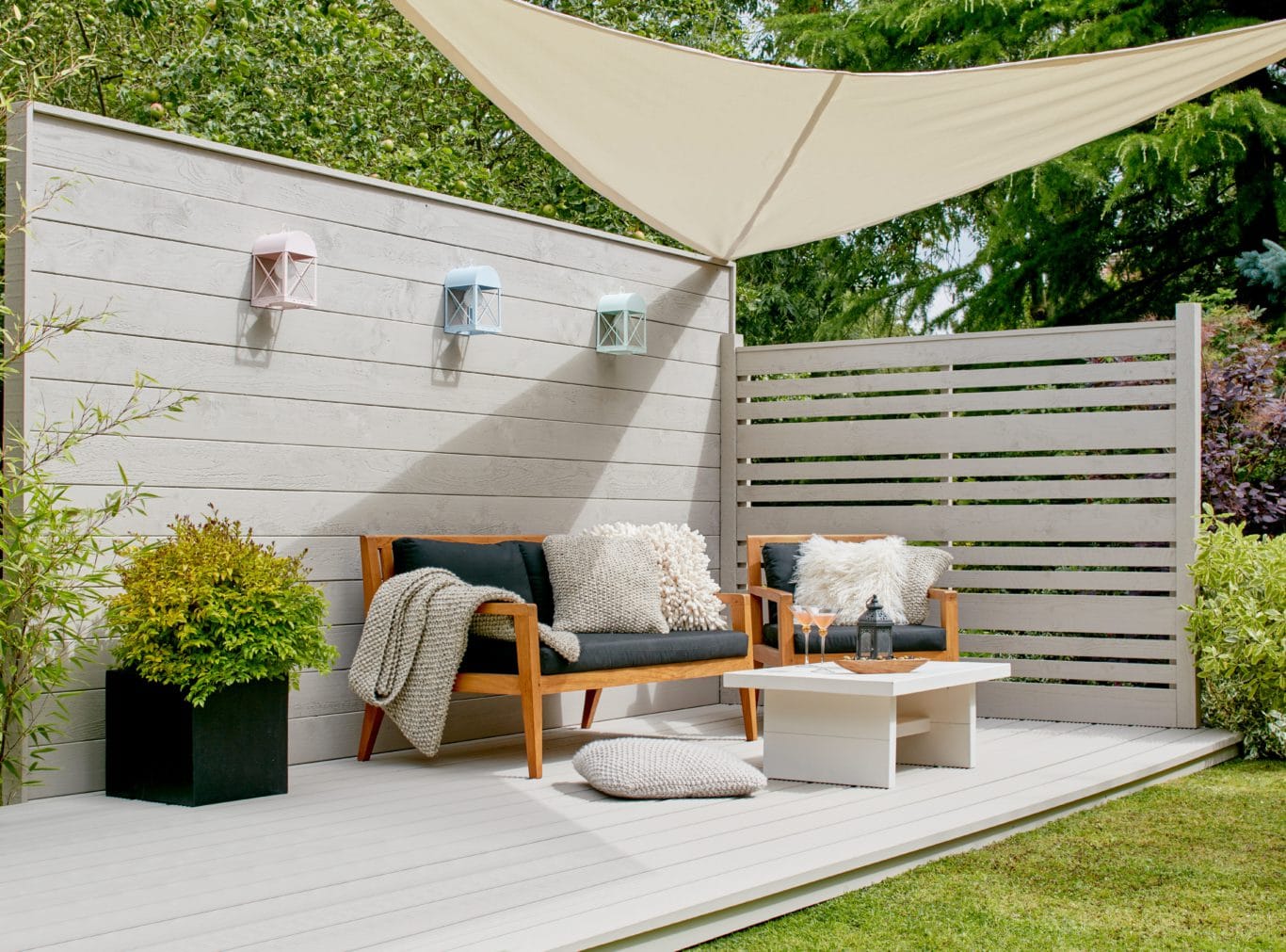
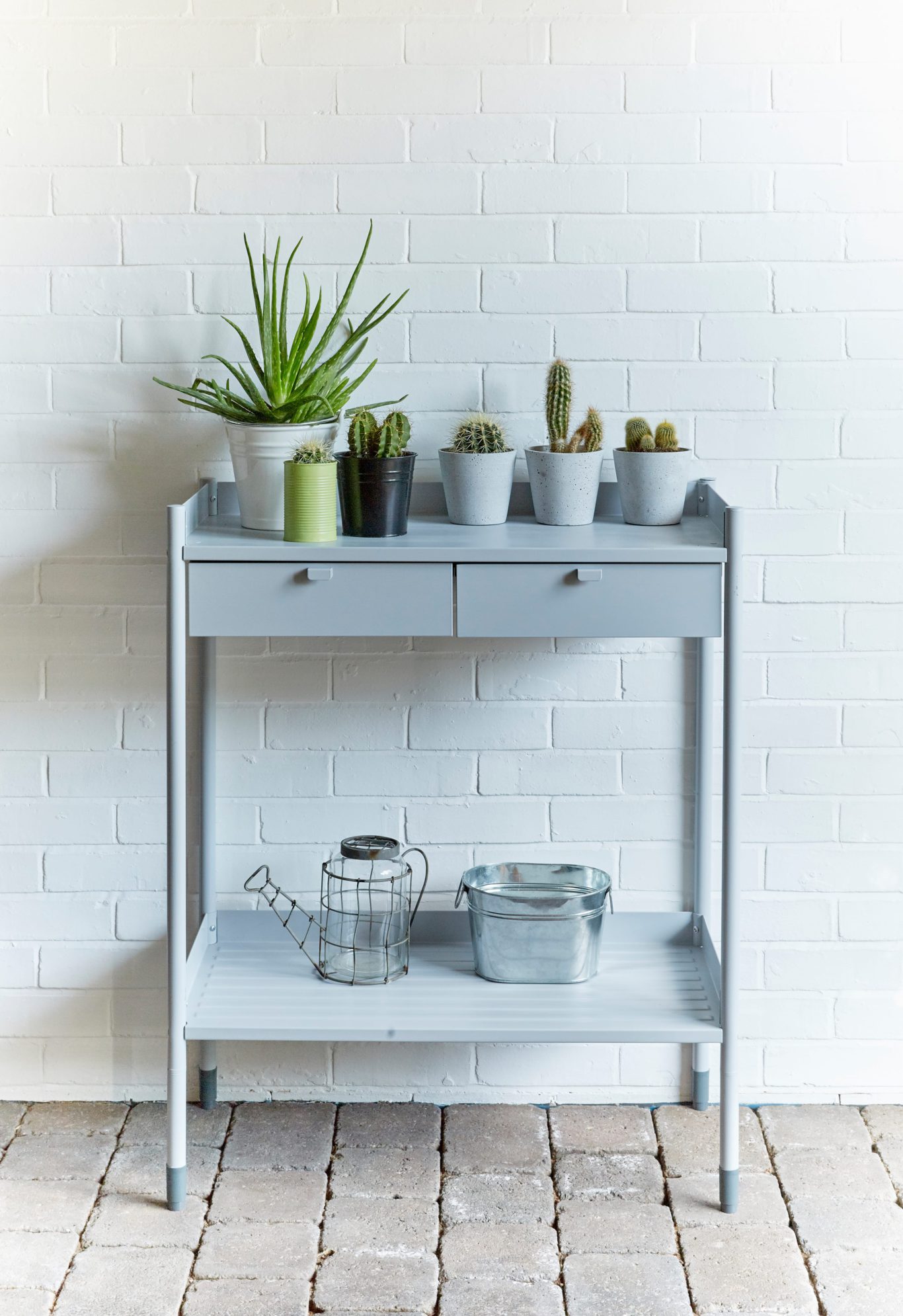
We utilised Ronseal’s existing packing line in a smarter way and designed each tin to have an oversized shade label. This change enabled us to use the same base tin for all items, giving a tailored design for every colourway and a cost effective solution. The labels had two purposes; as well as showing the product colour, they also featured bespoke aspirational imagery for each shade. This imagery showcased Garden Paint being used on a multitude of substrates – an important USP over the competition.
A clear winner
Using the product colour in this way enables consumers to easily find what they’re looking for in store. It also neatly acts as inspiration for what can be achieved with this range.
