We’ll be Seeing Red in the New Year
Far from just being a festive colour, we believe that red is set to be one of the most important colours for brands during 2018. From cherry to pillar box reds, from warm red to terracotta, we’re spotting these shades cropping up across fashion and retail, as well as being a strong key brand colour.
Red has often been associated with danger or anger and it’s never good to be ‘in-the-red’. But those of us who understand the millennial mindset know that they don’t hold these traditional preconceptions. Because they so regularly engage with brands on screen, these important and influential consumers enjoy standout colours and bold confidence. Brands like Just Eat appeal to a younger audience and are embracing this vibrant shade, whilst maverick brands like Virgin have always been proud to be bold.

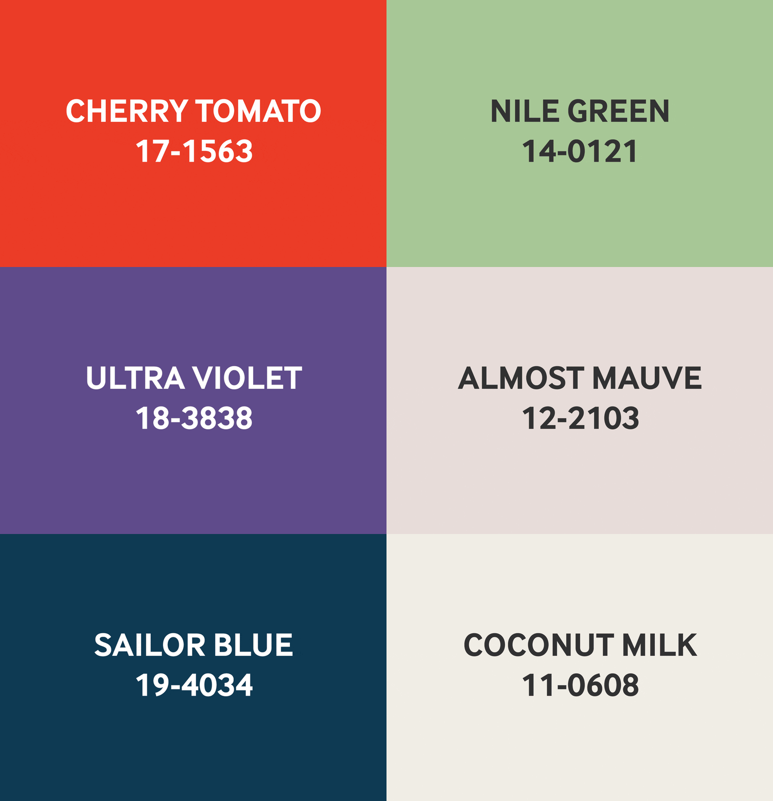
Pantone 17-1563 Cherry Tomato
Cherry Tomato is a tempestuous orangey red that exudes heat and energy. Demanding attention, this is a courageous, never-to-be-ignored shade that’s viscerally alive. Cherry Tomato is just one of Pantone’s 16 colour predictions for spring 2018.*
Pantone’s Spring Fashion Colour Trend Report
Staying with the theme of bright pops of colour, Pantone’s latest report predicts the trends for spring and the colours of our catwalks. Anyone working with interiors, packaging or branding will be wise to keep these shades in mind – they’ll certainly be influencing our design palette for 2018.

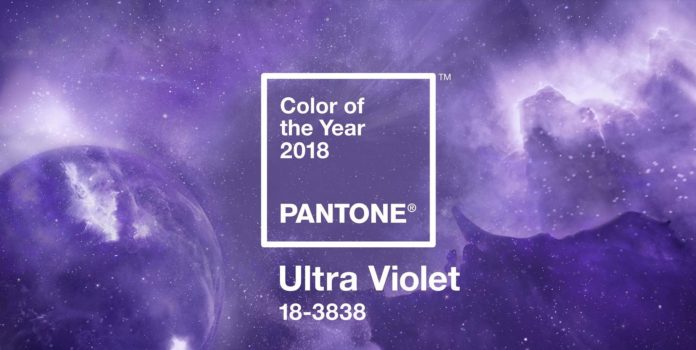
Announcing official PANTONE® Colour of the Year 2018
Here’s what Leatrice Eiseman, Executive Director of the Pantone Colour institute has to say about the Colour of the Year 2018 – PANTONE 18-3838 Ultra Violet.
“We are living in a time that requires inventiveness and imagination. It is this kind of creative inspiration that is indigenous to PANTONE 1-3838 Ultra Violet, a blue-based purple that takes our awareness and potential to a higher level. From exploring new technologies and the greater galaxy. To artistic expression and spiritual reflection, intuitive Ultra Violets lights the way to what has yet to come.”

Why Grey Has Had Its Day
The other standout colour for 2018 (featured in Pantone’s top 16 and their Home and Interiors Guide) is Teal. We’re already seeing it playing a big role for interiors, retail and corporate spaces. It’s big news and is rapidly replacing that traditional favourite – grey. It’s interesting to consider that teal is a mix of most people’s favourite colour, blue** and green, which has ethical and eco principles. So this modern hybrid is both familiar, and in tune with the modern zeitgeist.
Sherwin-Williams’ colour of the year for 2018 is their take on teal. It’s a rich, deep colour that they’ve aptly named Oceanside. We’ve certainly noticed a shift towards 70s & 80s style in today’s interiors, so teal looks set for a big comeback.
Is This Now the World’s Favourite Colour?
This bright teal was voted the world’s most popular colour in a global competition organised by Hull UK City of Culture 2017 and paper merchant GF Smith. Over 30,000 people selected this shade as their favourite, and it was named after competition winner, Annie Marrs, a UNESCO worker from Dundee – Marrs Green. GF Smith describe Marrs Green as a shade of teal inspired by the landscape surrounding Scotland. It’s opened up a debate here at Michon – why name it Marrs Green and not blue or simply teal – what do you think?
*Source: Pantone
**Source: yougov.co.uk
