Great design is simple
We aren’t saying it’s easy to create great design – if we were, we’d be out of a job; but our experience has proven, time and time again, that the key good design is simplicity.
In the late 1970s, famed industrial designer Dieter Rams detailed his ten principles of good design; these principles specifically relate to his expertise in product design, but all can be applied to modern, effective design across all media and disciplines.
His tenth commandment is, in my opinion, the most important of all.
“Good design is as little design as possible”
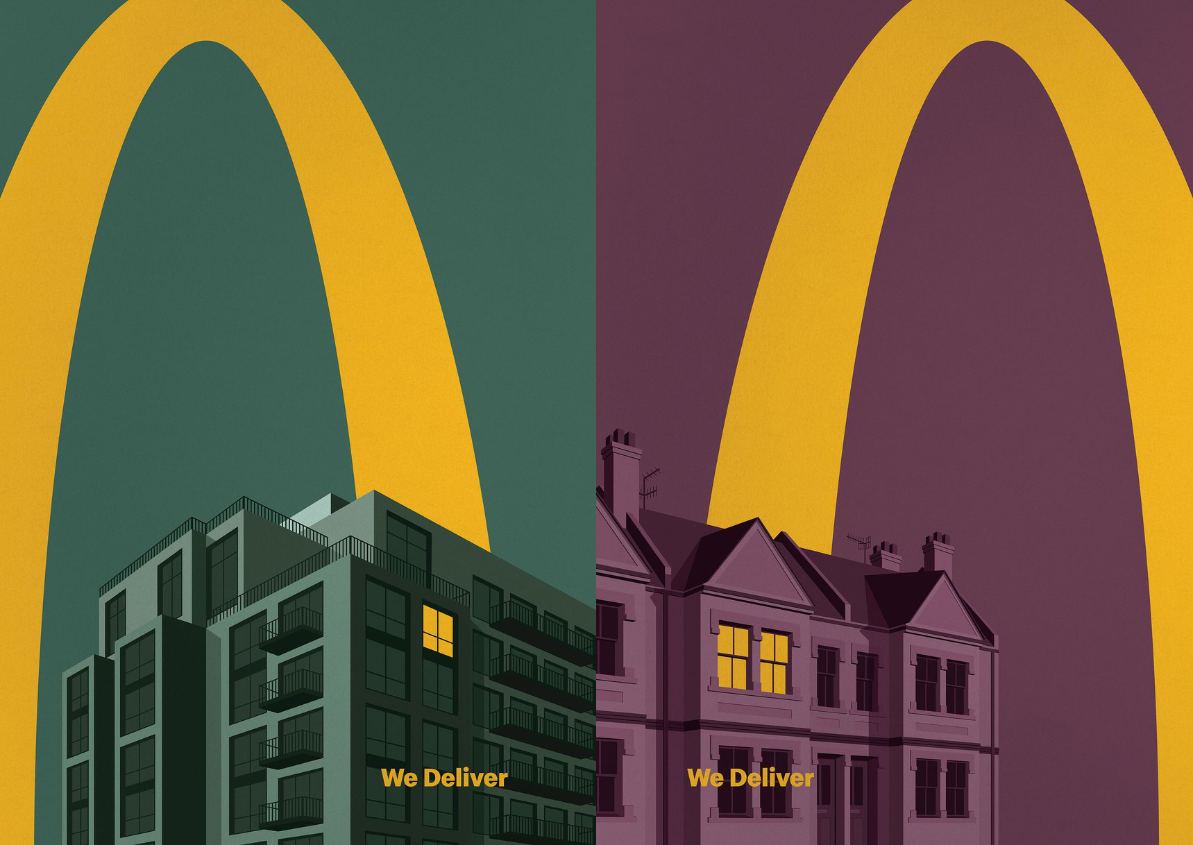
Less is more – because it concentrates on the essential aspects, and the products or services are not burdened with non-essentials. This is especially important in 2021 as the mobile experience continues to dominate and less time is spent engaging with communications.

When in doubt, simplify.
What are you trying to get your reader to do? If you solve one question it should be that. It may be to pick up a product, view your service as superior to the competition, to act, become aware of your social or environmental credentials, stay loyal, or switch to you. Clarifying ONE single-minded purpose will enable you to get the best out of your creative briefs, which in turn will get results.
The reason ‘simple’ works is that it is easy to understand. It is quick to digest, and it isn’t a hard sell. Your audience doesn’t get overwhelmed or distracted from your core message or brand truth. And talking of truths, you need to be honest. In truth lies loyalty.
You also need to pay special attention to the details. With a minimal approach, any mistakes will be highlighted. What you do says needs to be accurate, believable and on brand.

Aesthetics and user metrics
Looking good matters. Think of the artfully laid out plates of haute cuisine, they may be complicated to create but they appear beautiful and sophisticated in their simplicity.

“It takes a lot of hard work to make something simple, to truly understand the underlying challenges and come up with elegant solutions.”
Steve Jobs
Distinctive design, ‘clean and friendly and fun’ would become the hallmark of Apple products under Steve Jobs’ command. The applied art of creating minimal, beautiful products that are simple to use has helped Apple become the most valuable company in the world.
It’s all about achieving the perfect balance between getting your message across clearly and effectively and creating aesthetic appeal.
A study of websites by Google made two key findings:
- Users will judge websites as beautiful or not in about 50 milliseconds.
- Visually complex websites are consistently rated as less beautiful than their simpler counterparts.
- Searchmetrics research suggests 96% of sites in desktop searches and over 90% of those in mobile searches failed to meet usability standards.
Usability is especially important for digital design. The best, and simplest designs are usually faster to load, simpler to code and easier to navigate.
Simple design should always be user oriented. So, consider how long your customer will get or take to engage, and how easy it is to do so. Different customer touchpoints may require a subtly different design solutions.
The unadorned logo
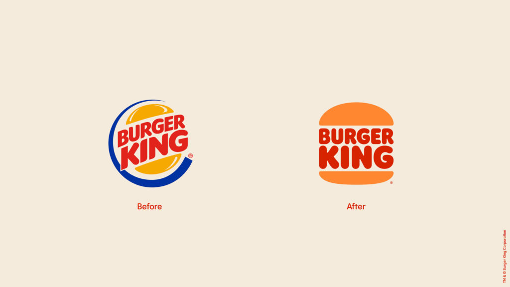
Logos aren’t escaping the simplification process. Some of the biggest brands have removed bevels, gradients, and gloss in favour of flat colours and strong contrast – all choices driven by the online user experience. You can quickly erode that experience with overly ornamented design.

Reducing content doesn’t mean reducing impact
Science has shown that humans can only hold a small amount of information in their ‘active’ or short-term memory, with just three or four words being easily recalled. Short, punchy copy with purpose wins the day. Just think about Nike’s ‘Just do it,’ ‘Dig for Britain’ and ‘Finger-lickin’ good.’ Three words have power. Imperative sentences drive action, emotive phrases speak directly to a persons need, but ‘tripling,’ or using the ‘rule of three’ – as adopted by Martin Luther King and Winston Churchill – is a proven way to maximise audience response.

So maybe rather than asking what you can put into your next communication piece, why not ask yourself what you can leave out?
Want to read more? You might find these articles interesting:
– Baxi Assure – brand proposition and development
– Rainbows Children’s Hospice – rebrand
– Less is more, marketing for minimalism
– Branding, it’s not just for your brand team
– Do you still love your brand?
– How to build brand trust