The key to successful city branding
City or place branding is more than just marketing the positive attributes of a place, it’s more than a well placed campaign to drive up tourism or investment. Place branding is about defining a city, town or region, giving it a clear, unmistakable and understandable identity.
It’s true, the aim of place branding is usually to change perceptions, to boost pride and belonging, and to encourage collaboration, driving tourism, economic, political or cultural development. But to work, it should be treated in just the same way as company or product branding, setting out your mission, defining your values and discovering the essence of the place.
Know your place
Before branding a place, it’s important to analyse current perceptions with thorough research that targets residents, visitors and investors, to find the facts and the core truths of their experiences. Only then can you establish the values and personality of a place.
A place brand, in essence, represents an experiential offering, but misconceived assumptions of a place can lead to inauthenticity and poor engagement.
It’s no good simply telling people what you want them to think, you need them to engage with something that really matters to them, and recognise how they feel and want to feel, only then will people take place branding into their hearts.
The power to change perceptions
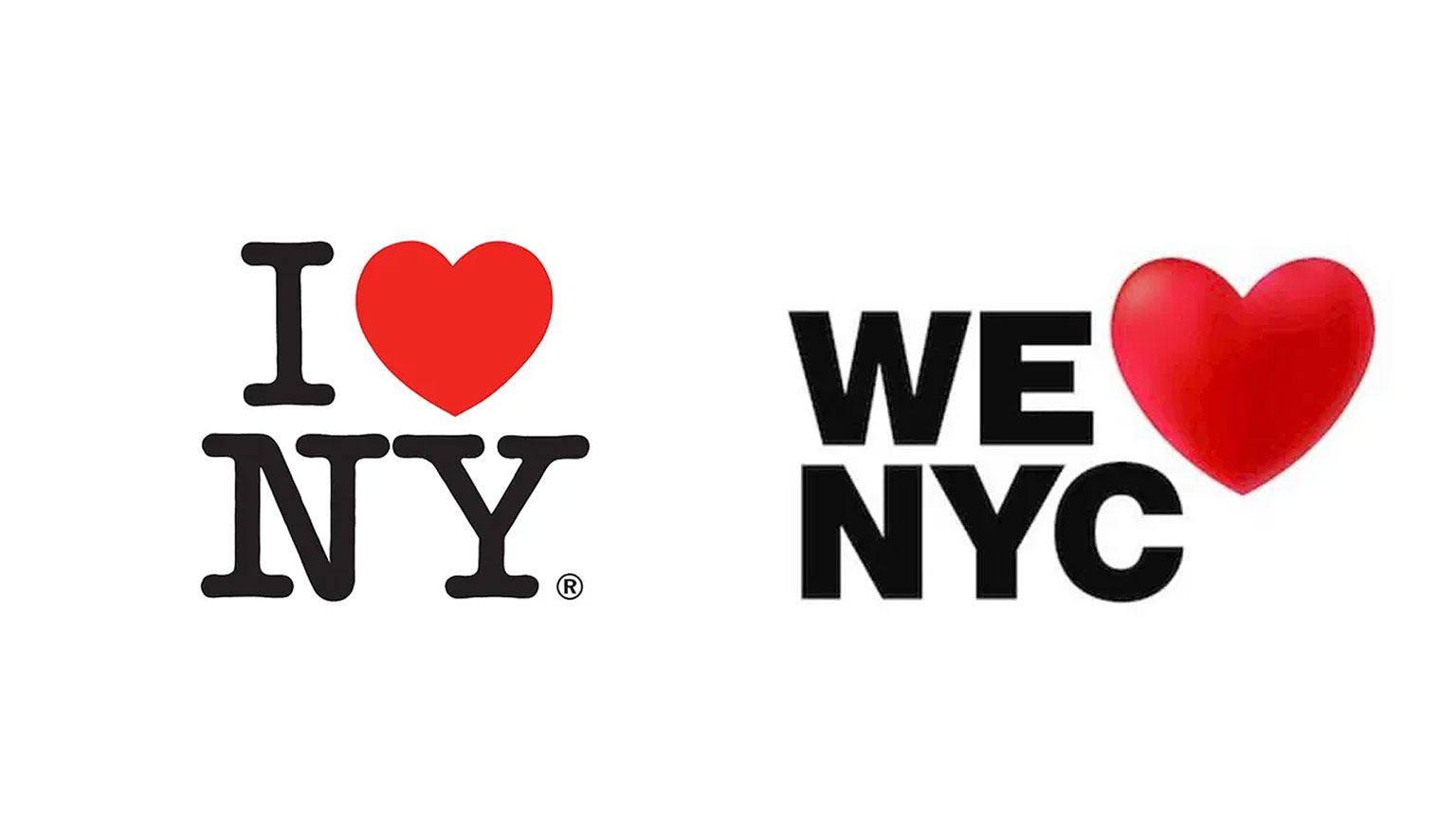
New Yorkers certainly took Milton Glaser’s iconic ‘I heart NY’ logo into theirs as the backlash to an evolved version of the iconic logo (launched in March 2023) proved. New Yorkers, it seems did not love the new ‘We heart NYC’ logo, and the shockwaves set the internet on fire.
If there’s going to be a riot in NYC, it’ll be over this.
A Twitter user
Was it simply that they felt ownership over one of the most recognisable logos in the world? Or, was it something else? The idea behind the change was to be more ‘we’ than ‘I’, to celebrate diversity and community.
The typography may not have been perfect and could be called dated, but the new logo fails to stand out in a world of conformity, so somewhat misses the brief. They may switch out the heart for emojis, but in a bid to appeal to a more socially driven audience they’re losing the loyalty of anyone who felt represented by the original.
And by saying ‘we,’ they lose the ownership and individuality of the original, no one likes to be told to feel something. It smacks of inauthenticity and dogma.
A new logo might have almost started a riot – the original one helped stop one.
In the late 70s the Big Apple had big problems. The city faced insolvency, the fire and police service were reduced to skeleton crews, and ‘an act of God’ saw lightening strike twice plunging everyone into darkness. Crime went through the roof and a serial killer prowled the streets. New York was dubbed ‘Fear City’ and journalists warned people to avoid staying in hotels or riding subways.
Commissioner John Dyson and Deputy Commissioner Bill Doyle decided to increase their tourism budget from $400K to $4.3million.
“I remember Bill Doyle saying that the words that matter in advertising are: ‘new,’ ‘free,’ ‘improved,’ and ‘love,’” recalled Dyson. “And he comes back the next day and says, ‘Well, ‘I love New York’ has ‘love’ and ‘new’ in it. So I got two of the four powerful words of advertising.’”
Milton Glaser’s award-winning rebrand tapped into the passion of the people who lived in New York.
“It was an expression of love and concern of the people who lived there – that was the basis.” Milton Glaser
By recognising residents and showing them some love, Milton Glaser’s award-winning identity more than tripled the state’s visitor spending revenue from $500 million in 1976 to $1.6 billion in 1977.
Be honest
Firstly you need a strong, authentic narrative. Find the essence of a place and tell its story, but tell its true story, because to work, place branding has to be honest. The ‘I heart New York’ is possibly the most iconic place branding ever – because it spoke to people who loved the place – in spite of its problems.
Positioning
The place brand essence and identity should match the values of the type of audience it’s trying to attract.
This brand positioning relies on knowing your audience. Don’t try to appeal to everyone but find the authentic experience, and speak directly to the audience who will love it.
Don’t compare, or try to be like somewhere else, you need to find what sets this place apart and what makes it memorable, and the simpler the message, the better.
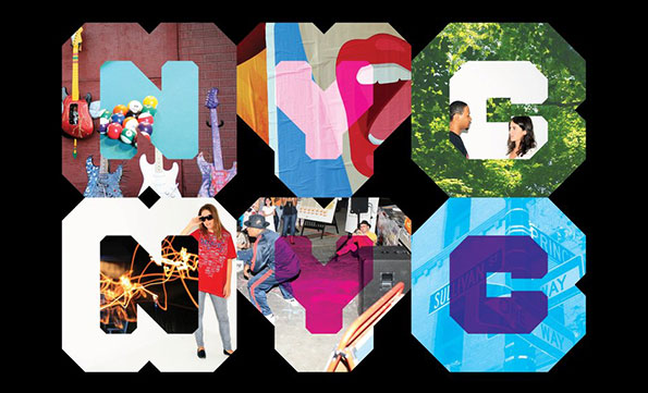
One example where there may have been too broad a brief, is the 2007 NYC branding created by Wolff Olins.
There’s only one New York City, but within it are five boroughs, approximately 191 neighborhoods, nearly a million buildings and over 8.2 million people. How could a brand successfully represent this diversity?
Wolff Olins
To represent an ‘almost infinite mix of cultures, ideologies, and ways of life’ the new brand look was created from sturdy letterforms which made windows to reveal images of a range of cultures, professions, brands and activities.
On the surface the vibrant designs seem to have worked, as 2008 became a record year with 47 million people visiting the city, generating $33 billion in visitor spending. However, the vibrant designs were not well received by residents, and the New York Taxi branding became a particular hotbed for hatred.
The decidedly mixed response was typical to branding that tries too hard to be all things to all people, and therefore falls short of real engagement. But where the vibrant designs did succeed, it was because they were flexible and bold, and above all they were aided by a clear investment in visibility.
Investment and co-operation
Any good place brand will need co-operation and commitment to consistency. Investing in cross-media communications is vital to build recognition and if local people and businesses can get involved and become co-creators you’ll encourage awareness and a sense of pride and ownership, which will, in turn, help build a brand’s longevity.
Here are some of our favourite examples of place branding:
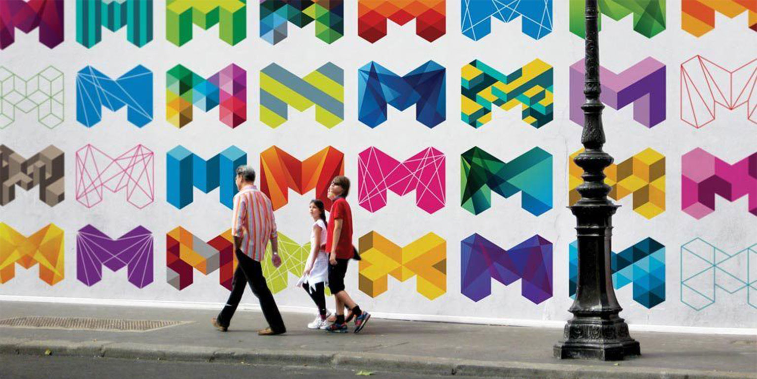
Melbourne, Australia by Landor & Fitch
“We created a brand that celebrates Melbourne’s culture, sustainability, creativity and tourism, and puts it where it belongs: as a big bold M on the global map.”
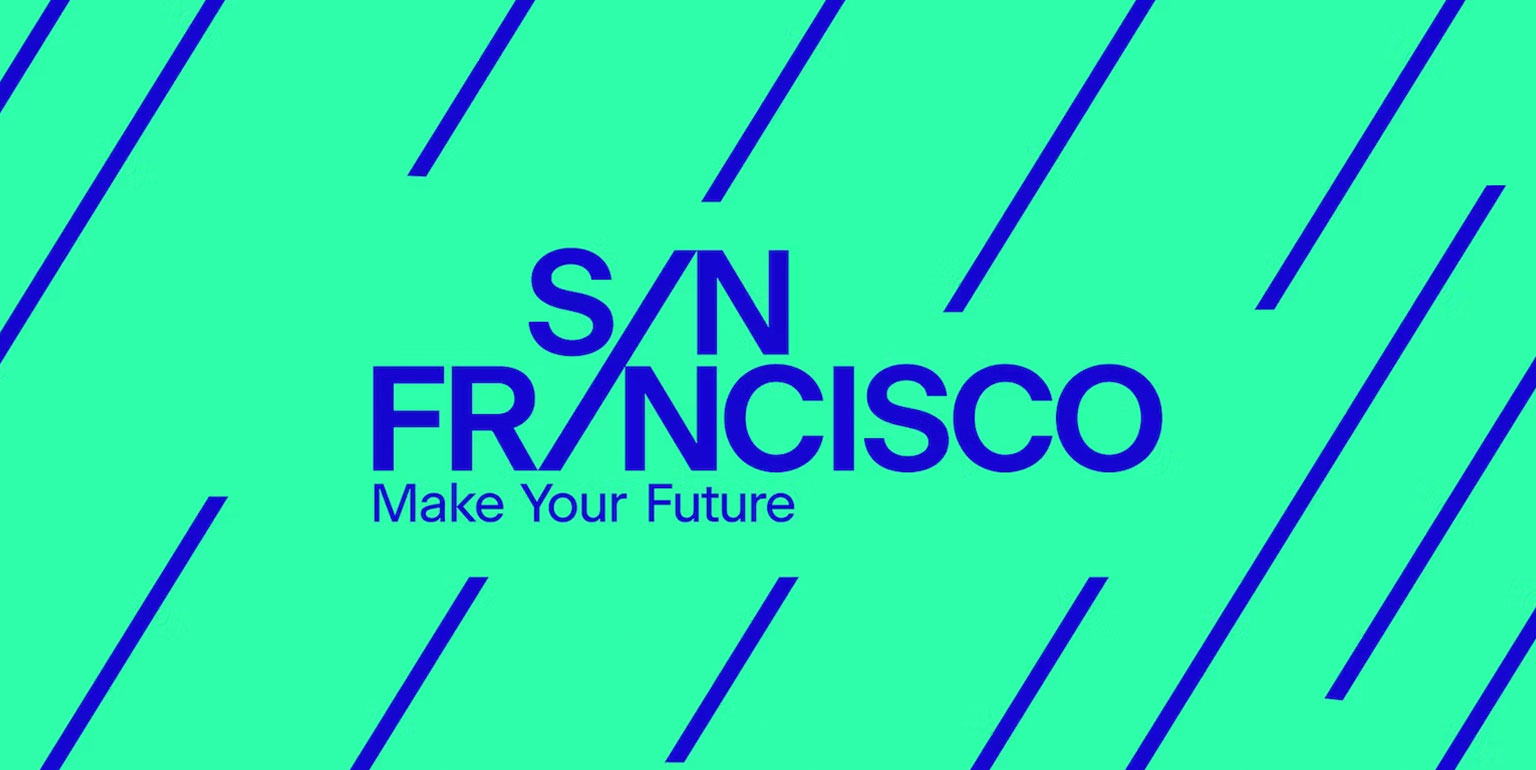
San Francisco, USA by Dnco
The logotype sees the two As in San Francisco blended into one diagonal upward stroke – which is designed to signal progress and appeal to entrepreneurs, while also referencing the city’s famously hilly topography.
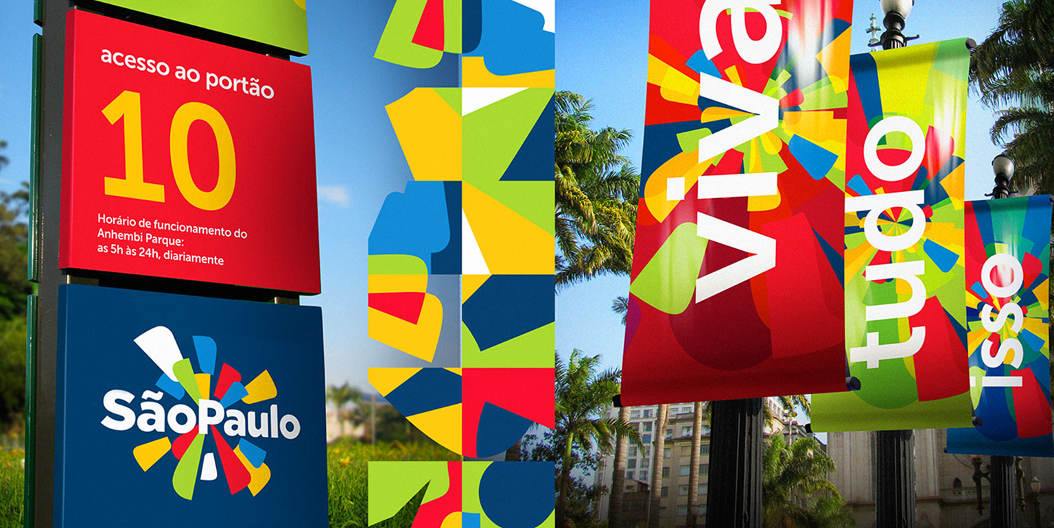
Sao Paulo, Brasil by Romulo Castilho
São Paulo, known by Brazilians as “the concrete jungle” injects life, colour and movement as it celebrates one of the largest and most populated cities in the world and its diversity, though culture, leisure and ethnicity.
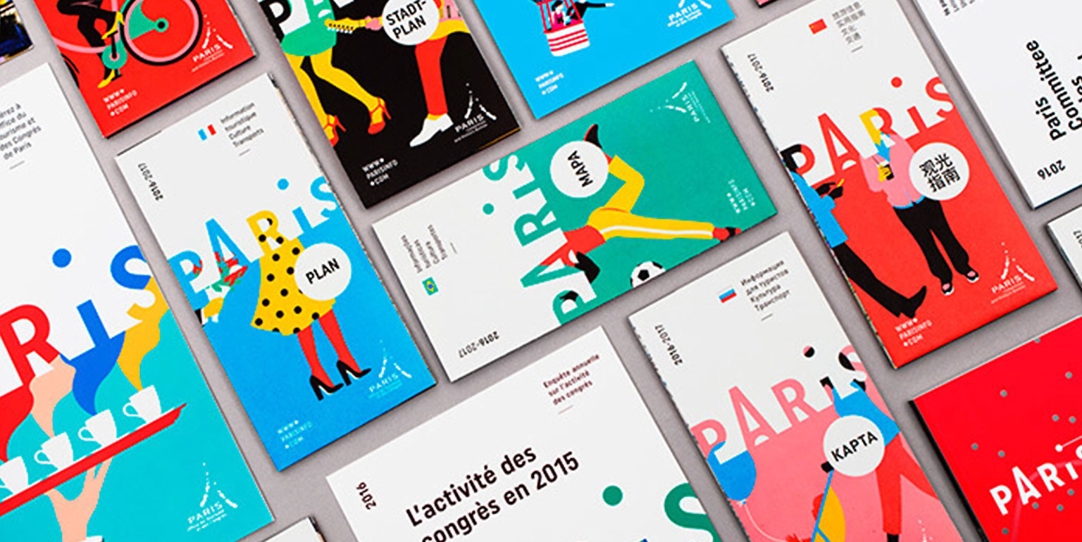
Paris, France by Graphéine
The Eiffel Tower typography is visually significant, authentic and memorable. It still has that French charm, but is modern and is complimented by colourful illustrations by French designer Séverin Millet for a cosmopolitan, avant-garde look.

Helsinki, Finland by Werklig
The wave motif is a nod to the city’s coastal location, and changes to reflect the architectural details of the city. It works as a tool for communicating contrasts, articulating the diversity of experiences the city has to offer.

Porto, Portugal by White Studio
Porto needed to be much more than a single icon, much more than a single logo. It needed complexity. It needed life. It needed personality. The patterns are inspired in the blue tiles that cover so many historical buildings in the city, and are created from icons that are recognisable landmarks, and represent the city’s accent and attitude.

Leicester Square, London, UK by Lantern
Leicester Square is a historic destination that’s home to some of the UK’s oldest and most beautiful theatres, cinemas and casinos. Today, it’s ‘The heart of London and the home of entertainment, and it welcomes 250,000 visitors a day to some of the finest new hotels, bars, restaurants and retailers.
Shaping places, transforming perceptions
So, whether you’re branding a country, a city, a town or an area like Leicester Square in London, there’s a huge opportunity to not only change perceptions, but transform the experiences of those who live and work there.
Do you need help with city branding or a branding a location? Get in touch – we’d love to help. Alternatively, for the latest marketing and branding news, take a look at our Articles page.