We built a powerful charity brand for Rainbows, which works effectively and consistently for all audiences.
We helped Rainbows reposition itself, from a brand predominantly offering care and respite for children and young people in hospice care, to a flexible service brand. We’ve evolved the brand to better reflect and communicate their core values, new capabilities and reach, which in turn enables them to give valuable support and care to even more families across the East Midlands.
A brand for today and tomorrow
We first created the brand style for Rainbows in 2017. Since then, the charity has adopted a new brand strategy and vision to enable them to deliver care not just when it’s needed but where it’s needed most – in hospice, hospital or at home.
Getting to grips with diverse audience needs
We conducted research to really understand the differing and sometimes opposing needs of each audience. From the families and fundraisers, to the public, businesses, community care givers, and hospital staff, we uncovered what they each needed and expected of Rainbows.
We then developed, and tested the new brand purpose, design elements and terminology, to discover which was understood, and which resonated most.
A brand with purpose
We know that purpose-driven brands are more effective at driving engagement, so we shifted the focus from the hospice and put Rainbows’ purpose front and centre.
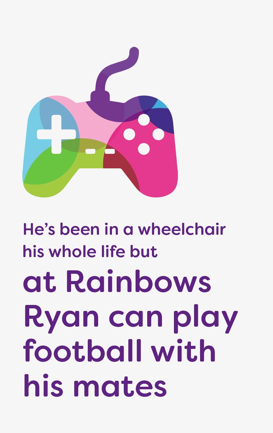
‘Brightening short lives’ is positive, engaging and instantly conveys ‘why’ Rainbows exists. It also resonates across all age groups, from neonatal babies to young adults.
A new brand footer now communicates the brand’s reach at every touchpoint, making it clear that care can now be accessed at the point of need.
Our brand was well liked and recognised amongst our supporters, it was bright, positive and friendly, and we didn’t want to throw that away.
Head of Marketing - Rainbows
But now we can deliver against our new brand strategy and vision.


A flexible approach
Creating flexibility and an expansive approach was key to addressing the unique needs of so many differing audiences.
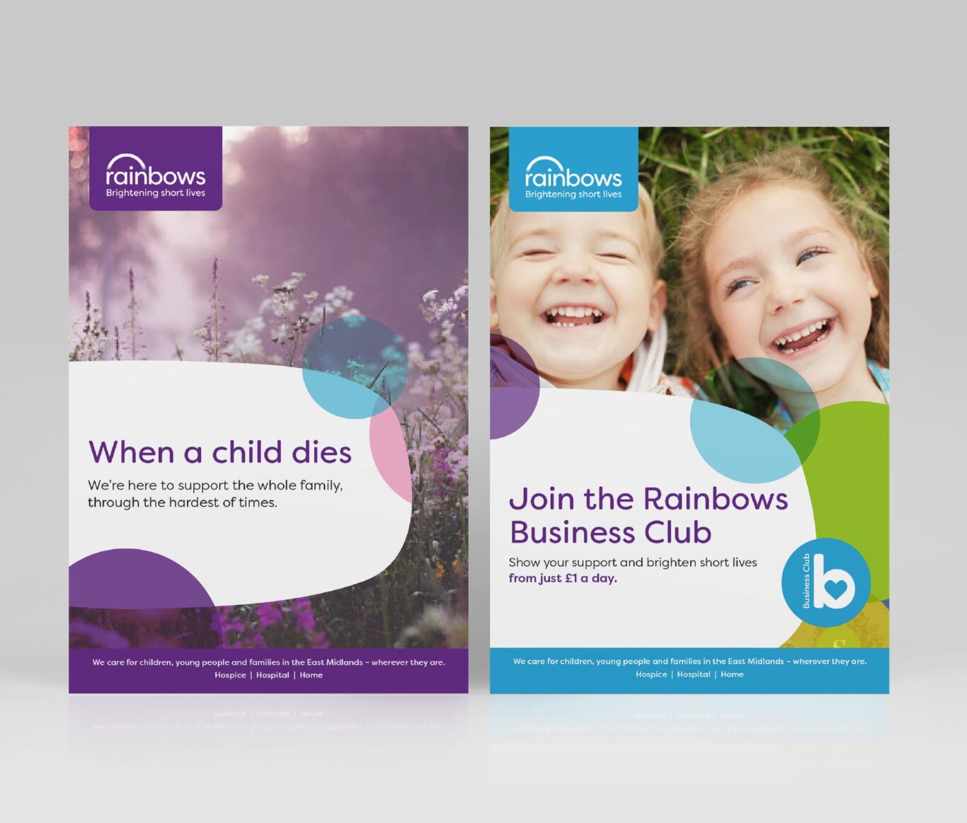
Restricted colour palettes and tweaks to their tone of voice guidelines were introduced for Rainbows Business Club and hospital bereavement communications. This gave them their own point of difference while maintaining a close bond to the overarching Rainbows brand. It also enables them to consider the unique language, understandings and sensitivities of each audience.
A considered solution
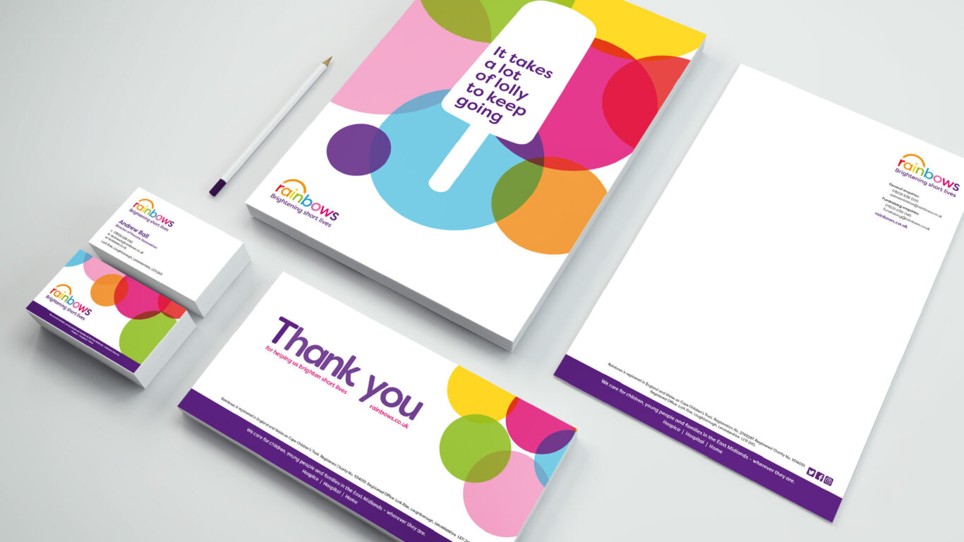
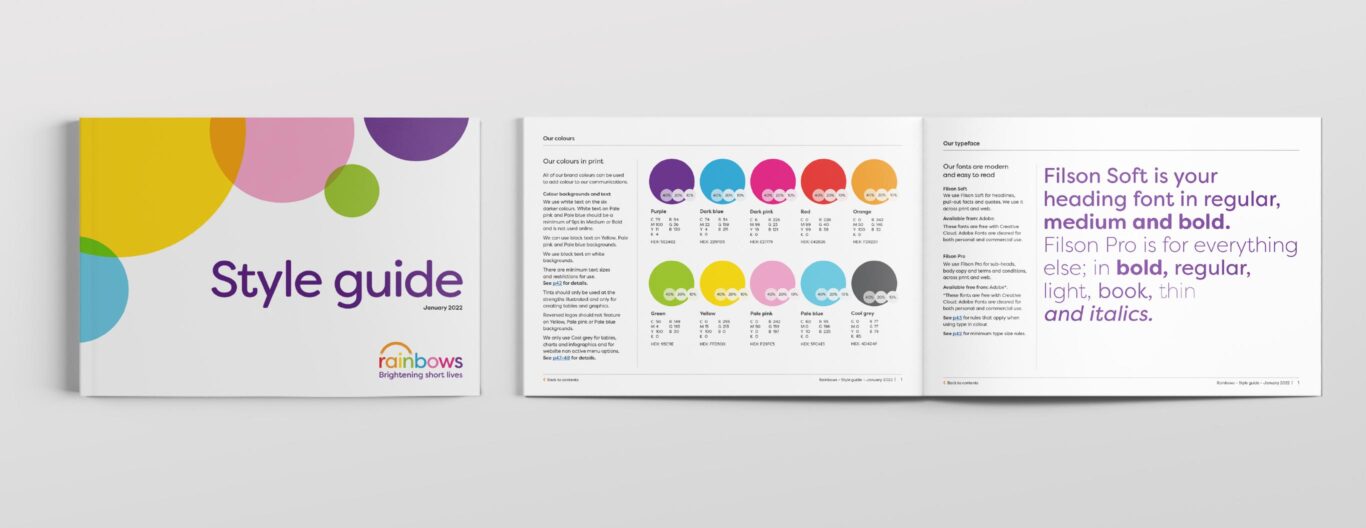
The new evolved brand, logo, tone of voice, colours and fonts also improve legibility and accessibility across all media to all audiences. It now reflects the all important brand changes while still retaining valuable brand equity.
A set of comprehensive brand guidelines, design templates, free fonts and assets enable the Rainbows charity to launch the new evolved brand in a consistent and cost effective way.