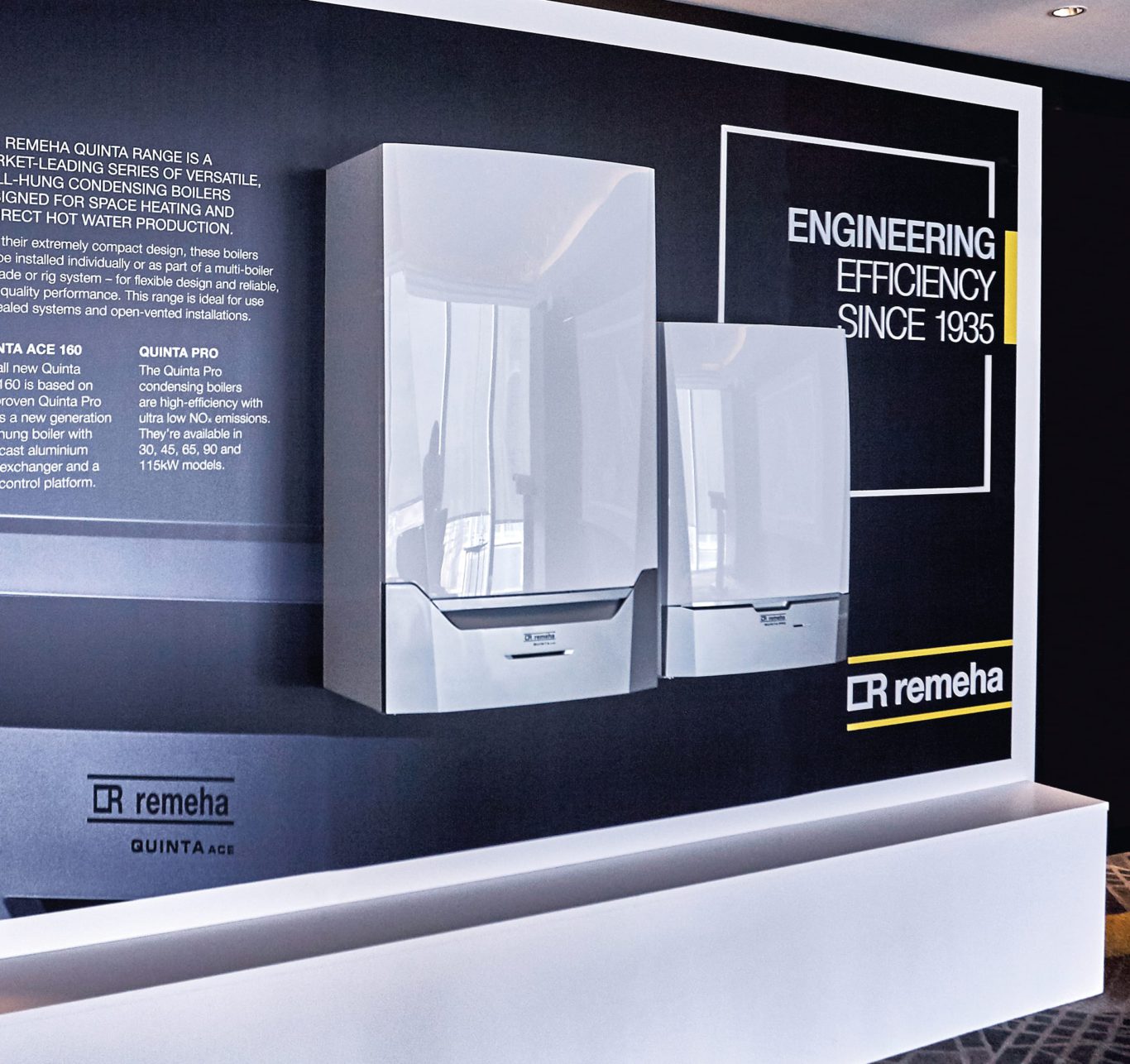
Repositioning and developing the Remeha brand to leverage and define its market leading credentials.

Remeha are one of the UK market leaders in commercial heating solutions. Working closely with stakeholders and collaborating with insight and planning partners, we’ve repositioned the brand so that it now resonates more effectively with its business-to-business audiences.
Creating the narrative for time-poor audiences
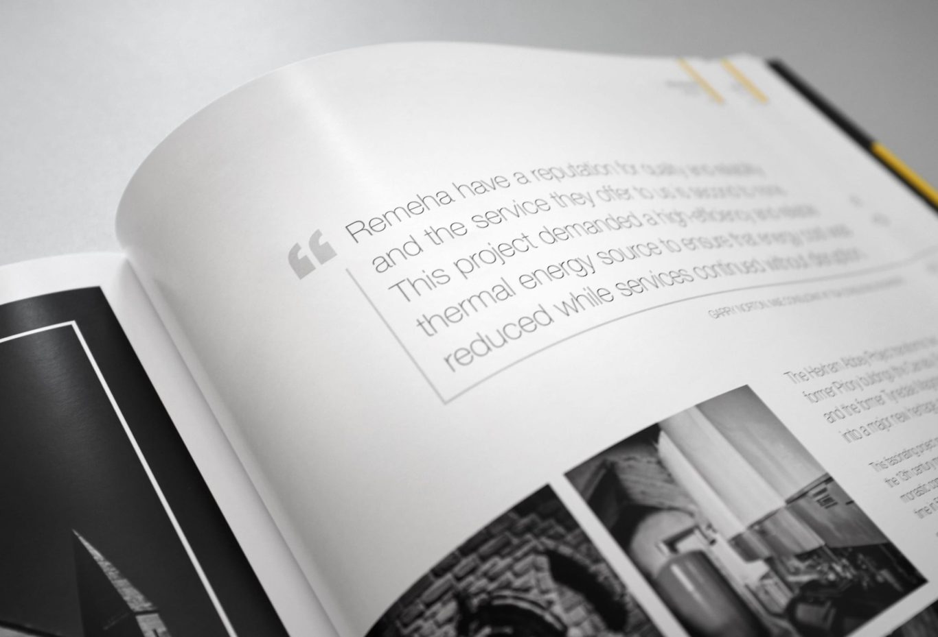
Our full brand architecture development was formulated on comprehensive customer research. It helped us to strengthen the brand story; redefine reasons to believe; develop the core proposition; and build a compelling brand story and narrative to position Remeha, as the premium commercial heating solution providers they are.
A strong design language that’s unique for the market
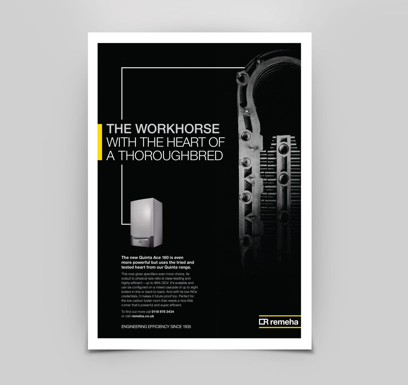
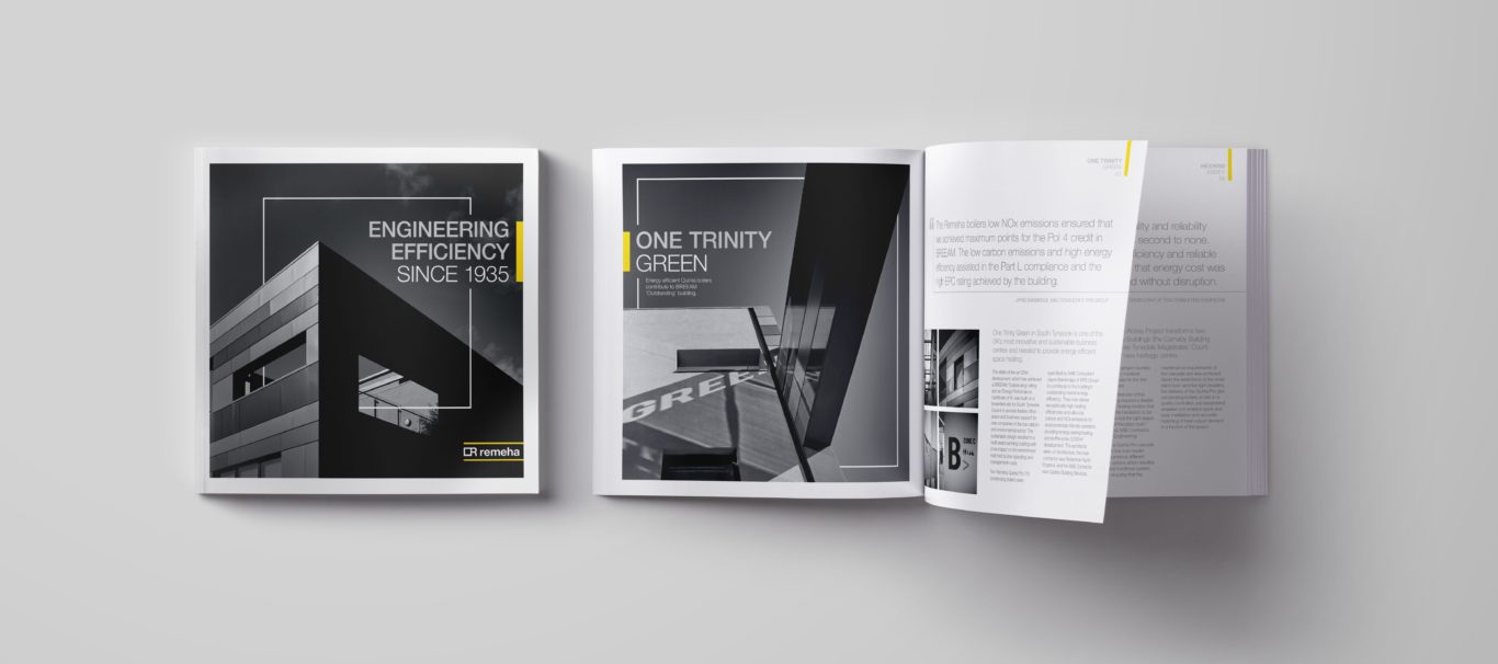
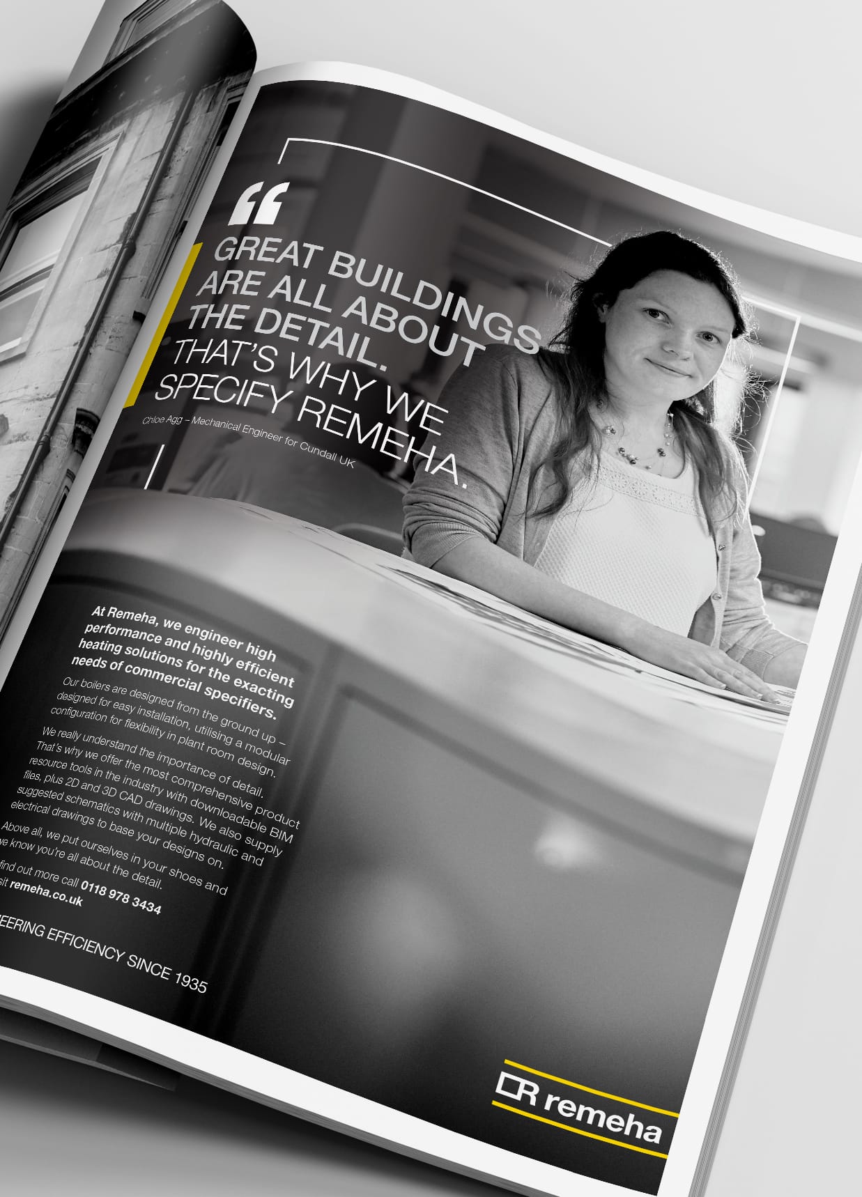
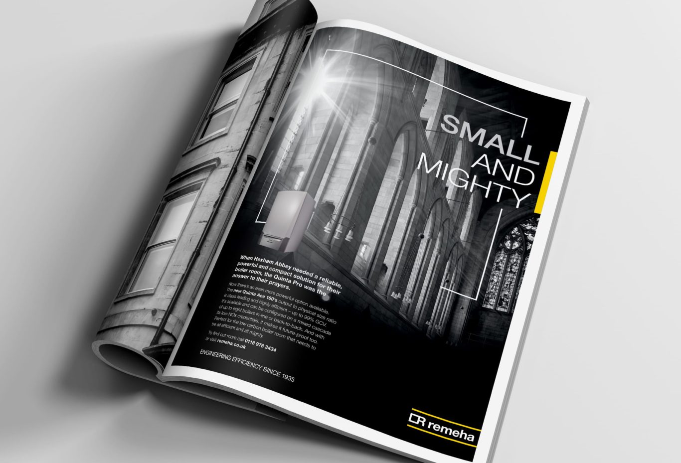
To drive greater consistency on all comms we developed a distinctive square frame to be incorporated extensively throughout the brand. This visually links directly to the logo and the symbol for a boiler ‘on plan’. It’s simple, strong, modern, flexible and distinctive forming the backbone of the identity, connecting everything around it.
Unlike its competitors, Remeha’s brand is now modern, dynamic and premium, reflecting its reputation for excellence, precision, innovation, quality and performance.
Engineering Efficiency Since 1935
Remeha – Brand proposition

A bold, premium approach
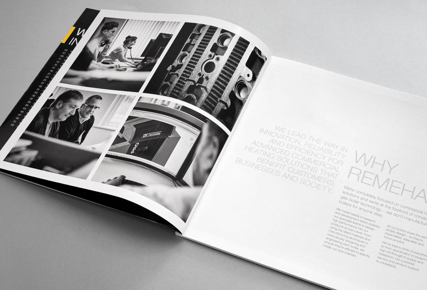
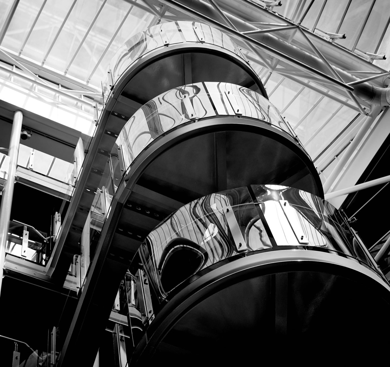
The brand’s premium positioning is further enhanced with striking black and white architecture and product details. We used bold typography and white space, while the subtle use of yellow links back to and builds on established brand equity. Language style and tone of voice are credible, consistent, succinct and honest to reinforce Remeha’s core brand promise.


