Has the digital age killed the typeface?

Looking around at brand typography, it can feel like a dark dystopian design world out there, void of creativity. It’s like The Handmaid’s Tale, we’ve dressed our brands in typographic outfits of sameness, no one stands out or has their own voice, and nowhere is this more obvious than in the logos we encounter every day.
Brand identities have almost universally adopted the uniform of conformity, in the shape of the sans serif typeface. It’s as if we’ve sent our fonts into the wasteland to fend for themselves – thinking they no longer have anything to offer.
Just like the brutalist architecture of the sixties, the sans serif was born out an ethos of social utopianism.
The brutalist buildings of the 60’s projected modernism and self-confidence, with their stark, simplistic and fit-for-purpose style because they were created out of necessity – to house the masses.
Today’s utopian brand vision is one of inclusivity and accessibility, causing companies to clamber for identities that won’t offend or turn potential customers off. The sans serif’s simplicity fits the bill, going a long way to explain its popularity. There’s no room for offence, confusion or misinterpretation.
Fonts without serifs are considered fit for purpose in a digital-first world. They’re straightforward and easy to read and suite well with web safe fonts such as Arial. They work perfectly across all digital devices – even at a smaller scale – improving legibility and user experience.
Or, at least this is what we so often hear. In fact according to the National Centre for Biotechnology Information (NIH), readers with normal vision may not need this consideration.
‘Our data showed no difference in legibility between typefaces that differ only in the presence or absence of serifs.’ NIH National Library of Medicine, National Centre for Biotechnology information

And type designer Jonathan Hoefler said:
“We always hear the argument that sans serifs somehow perform better on screen. They really don’t. You can render a serif letter in seven pixels, and it’s been ages since any of us were confronted with screens so coarse.”
There doesn’t seem to be any documented evidence or research into whether serif, or sans serif fonts, come out on top on our small-scale digital devices. At Michon, we think a lot can be said for font weights, careful kerning and a bit of common sense. If your audience is older or has reading difficulties, then a sans serif does make sense, as sans serif fonts offer improved legibility for these audiences and those with dyslexia.
Surely, it’s safer to choose a sans serif for your brand?
To answer this question, it’s worth doing some competitor research first.The ubiquitous sans rebrand has affected almost every sector, including the luxury market: Burberry is the latest big brand to shake off any semblance of heritage and craft, introducing a new utilitarian font (a stylised version of the Styrene B typeface). Taken in isolation you could describe the rebrand as a modern triumph; but when amongst some of its competitors and we lose all brand distinction, which is ironic for an industry built on style and expression.
The term ‘reblanding’ has been around for well over a decade – and describes perfectly the mass homogenising of brand identities.

Distinction and recognition are fundamental brand requirements, but there’s a lot more to brand distinction than your logo font. Secondary fonts, colour, character and language can all help your brand to stand out and be identified.
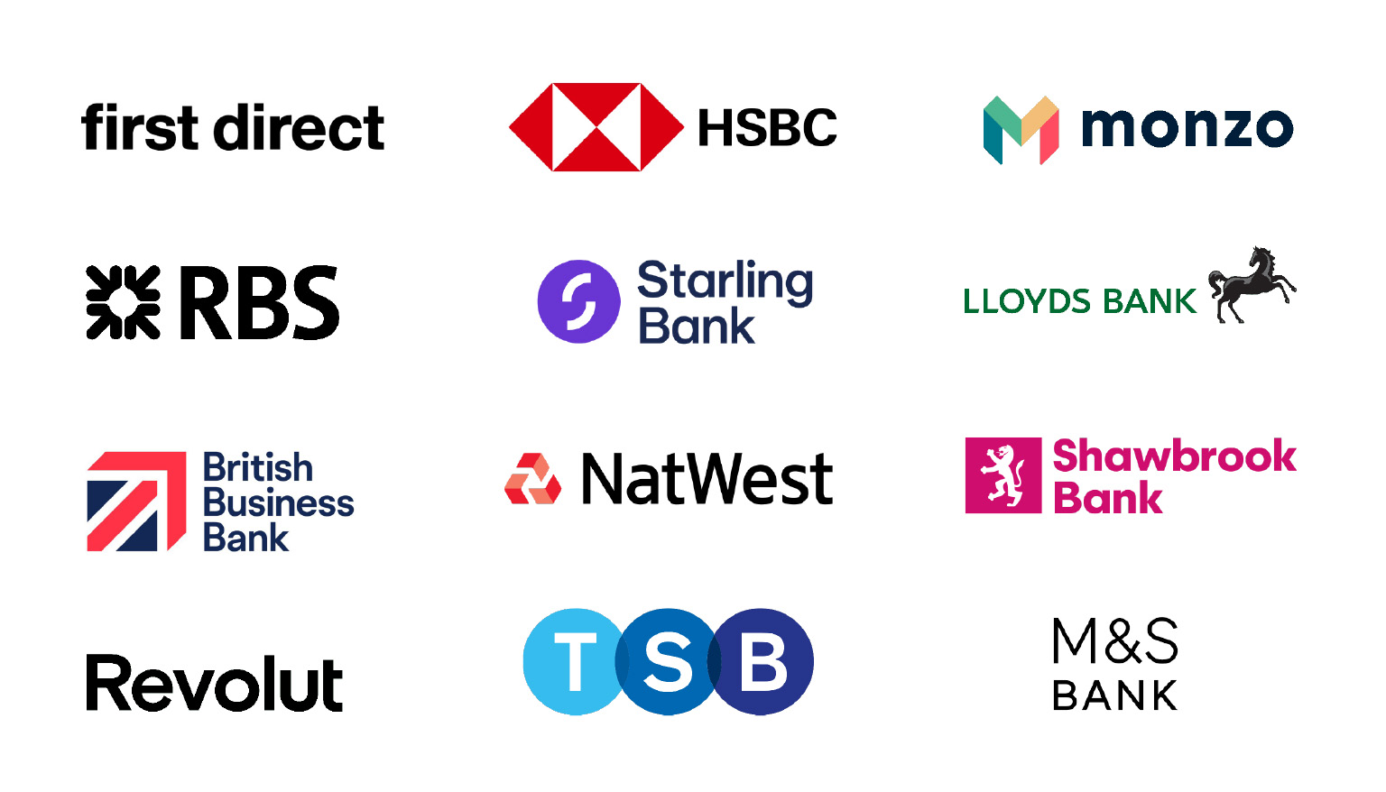
When challenger brand First Direct first came onto the banking scene in the 90s, they stood out as a modern, no nonsense bank amongst the sea of stuffy, traditional and outdated financial institutions that sported serifed fonts. Four decades later, and the surviving banks have almost all jumped onto the bandwagon, dropping their serifs, scripts and swooshes, relying instead on bold colours and brand marks to reclaim recognition.
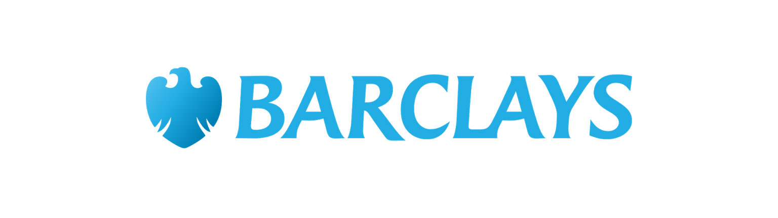
One notable exception is Barclays, whose logotype is based on the typeface Baker Signet, designed by Arthur Baker. The font has classical lines with subtle serifs, but we have to admit the identity feels old-fashioned in comparison to the brand’s on-trend competitors.
So what does a brand do when they no longer stand apart from the competition? Well, in First Direct’s case they decide to add an identifying mark that says something else about their offering.
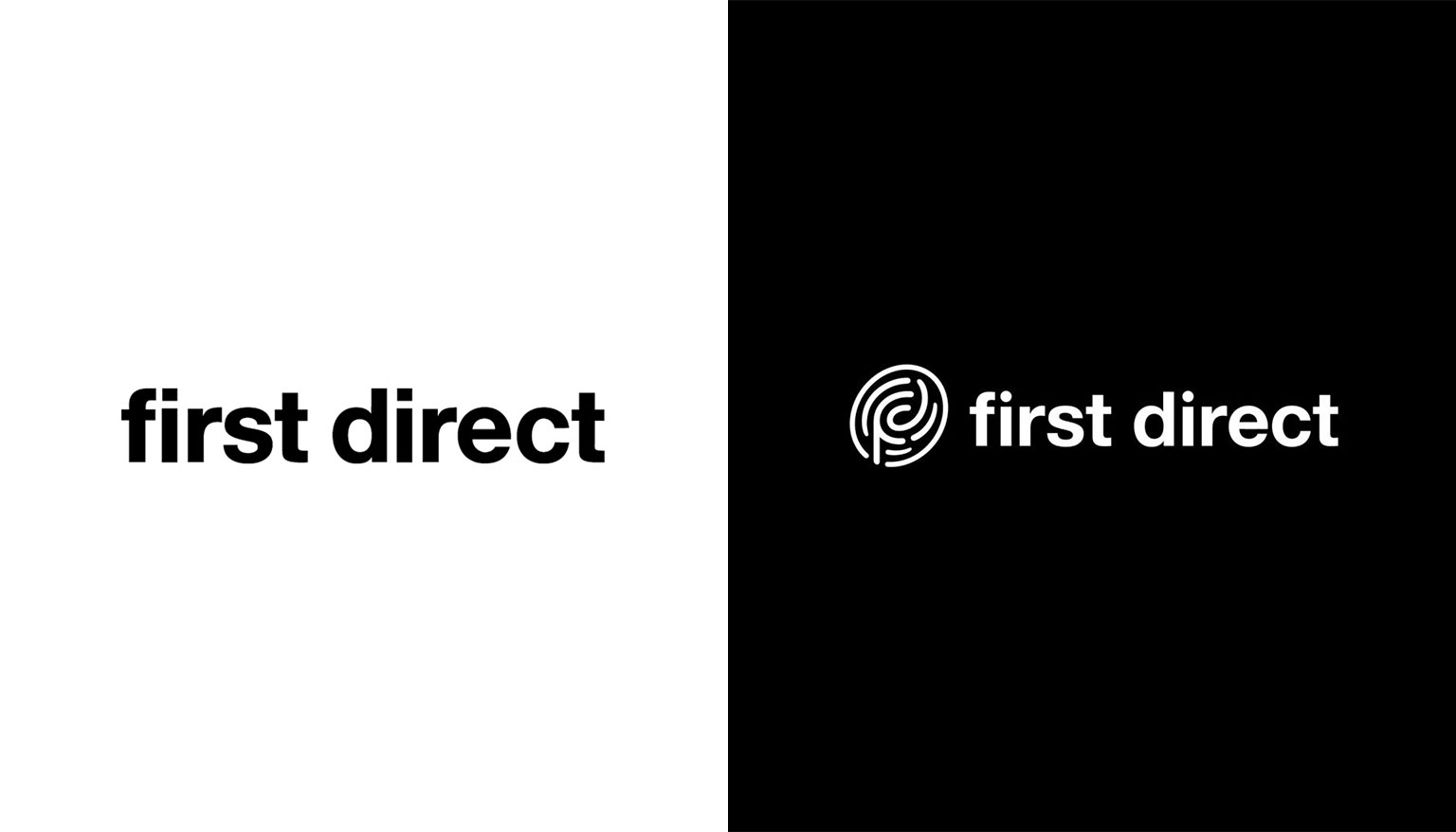
The new fingerprint icon represents a Digital Secure Key, an extra layer of security that has been built into the First Direct App. The old brand lived and died on being straightforward and simple. The rebrand stylistically just feels a bit off. Yes, the icon features a stylised ‘F’ and ‘D’ but the weight and rounded style feels at odds with the logotype.
Let’s go back to The Handmaid’s Tale because it was full of devastatingly good attention to detail and secret symbols – and this is what type can also still do for us, subtly showing us a brand’s personality. Logos were, and are, a valuable tool in the brand kit, and logo typefaces should reflect a brand’s values.
The rise of the anti-sans movement
The digital drive for clarity has no doubt influenced the trend for sans serif fonts in logo design and killed some of our identities in the process. However, this stylistic shift is being challenged.
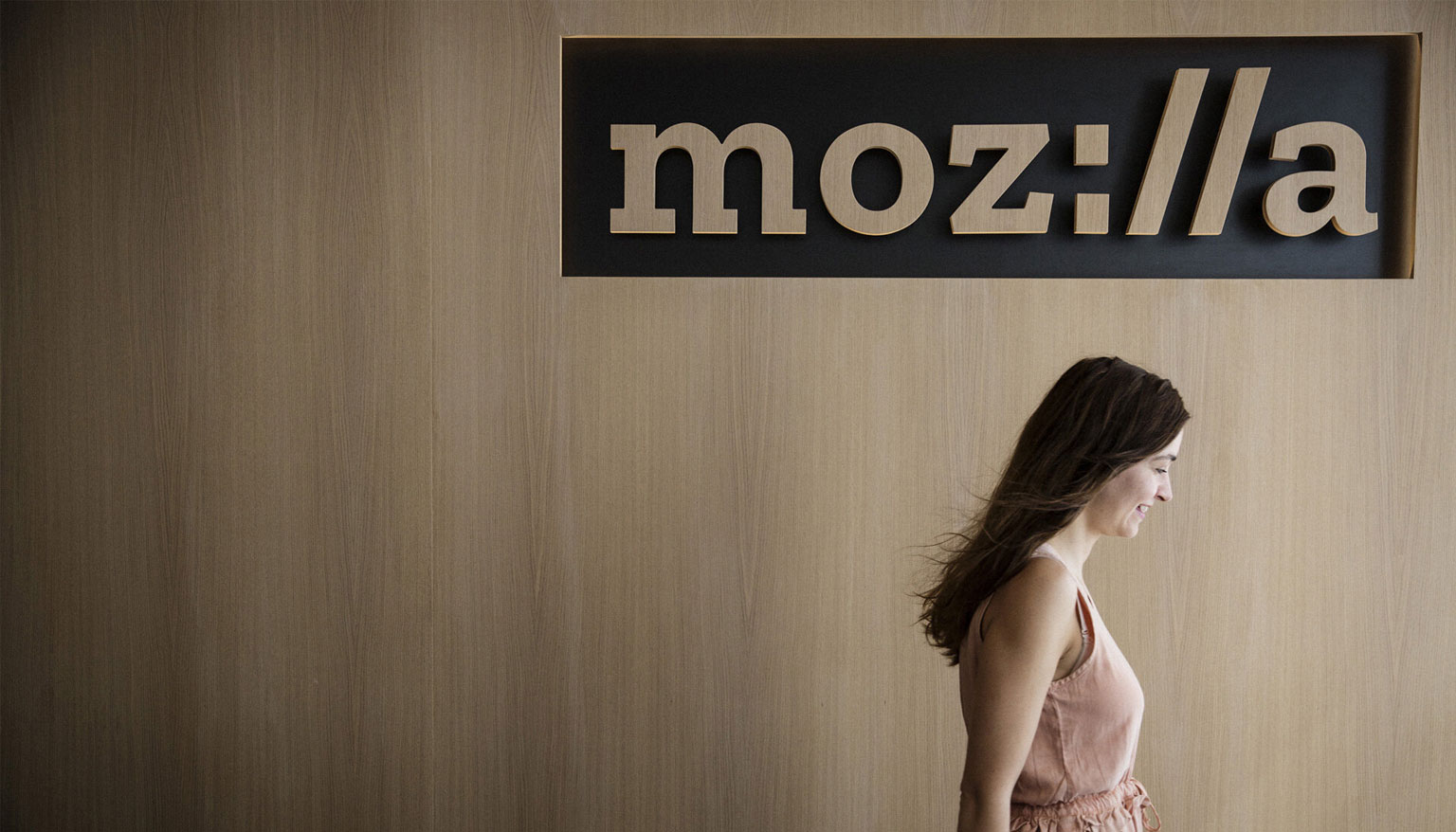
Mozilla – the nonprofit makers of the Firefox browser – are striving for a free and equal internet for everyone. They have a different approach and their typeface is their identifier.
Their zilla font, is based on a slab serif style, chosen because much coding is still done in ‘typewriter’ style fonts. The geometric and contemporary logotype contains clues to the brand’s reason for being – part of the http:// protocol is embedded in the identity, putting the internet at the core of their offering and their logo.
It seems that more companies are now prepared to use their fonts to say something about who they are, and understand that type can be ownable and full of personality – which has to be a good thing.
The tricky thing is to find the right balance between a strong identity that maintains brand recognition while keeping the identity functional, legible and long-lasting.
Challenger energy company Bulb opted for a script font. This was a brave move as scripts do not usually work well at small scale and can be hard to read. But with a short name like Bulb it can work. Here the logotype is a literal interpretation of a neon tube light.
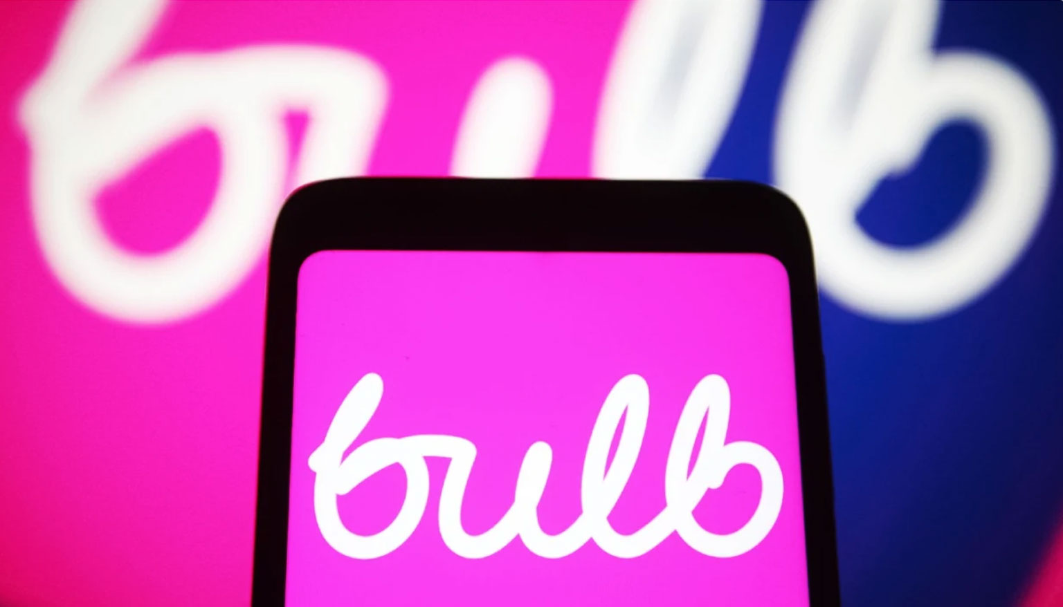
Bulb prided themselves in offering simpler, cheaper and greener energy and they stand out from the crowd. The identity doesn’t scream trust or green and the fluorescent pink could be perceived as youth orientated, but the organic feeling of the hand-lettered type also brought refreshing warmth and humanity to the utility brand, and in an industry where the big six have lost a lot of love, being different can be an asset.
Unfortunately, like many other energy brand challengers, Bulb are now in administration. Their fate probably decided by wholesale energy prices; but whether their bold brand choices had an impact, we’ll never know. It still stands as a good example of how important it is for brands to align decisions that make a brand distinctive and memorable, with the brand values, and the audience’s values.
Choosing fonts for your brand
Whether you have a logo already, or are starting from scratch, crafting successful type combinations relies on fonts that work together to create a unified brand style. Many companies (and we include ourselves here) have adopted a sans serif logotype, and chosen a secondary serif font for headlines to keep things interesting.
Fonts also help us to identify levels of content importance. They serve as signposts, telling us when we are changing topic. It’s therefore key to choose a group of typefaces that are cohesive at level of type hierarchy, from the logo font to headlines, subheads, body content and legals.
It’s worth considering:
- Fonts that compliment or contrast strongly with your logo type.
- Fonts that are versatile enough to deliver consistent brand expression across every touchpoint.
- Internal system font choices can be limited, that’s why Arial is so popular! Creating a cohesive type set across both internal and external audiences may be more easily achieved using sans serif fonts.
- Multiple language options may limit font options.
- Traditional serif fonts are a good choice for extended paragraphs of printed text such as brochure content. Our eyes are accustomed to the letter shapes and flow over them easily, aiding legibility. When text is small, serifs may have slightly improved legibility for those with normal vision, due to the natural increase in spacing.
- Your audience, their age and abilities. Eyesight degrades as we age and sans serif fonts offer improved legibility for older audiences and those with impairments or dyslexia.
- Bespoke typefaces are ownable assets and can be worth their weight in gold for larger corporates, especially when compared to buying multiple licenses for a typeface that competitors can use. However, creating a bespoke font can be expensive and time-consuming. You’ll need to weigh-up whether they’re on-budget and worth the investment.
Blessed be the font
In conclusion, there are still very good reasons to choose a sans serif for your brand, they are honest, reliable, predictable … but there are other options out there. All hail the typeface that is accessible and truly represents your brand’s position, offering and personality – whether that be a sans serif, or something that dares to be different.
If you’re updating your logo or website, or rebranding, we can work with you to make informed font choices. Get in touch – we’d love to help. Alternatively, for the latest marketing and branding news, take a look at our Articles page.