In praise of packaging
Packaging is vital for protecting products, protecting consumers and extending shelf life. It presents products in a convenient way and communicates everything a buyer needs to know. In short, good packaging sells products.
In a bid to better understand how brands have turned packaging into one of their most valuable brand assets, I asked our creative team to share their all-time favourites.
Is this the best packaging ever?

Rachael – Jif Lemon
When taken shopping as a child, I was repeatedly told to “look with your eyes, not with your fingers.” But it was a habit I found hard to drop. The truth is, I still employ all my senses when weighing up a purchase. My eyes spot the products that “jump off the shelf,” my nose knows when I’m near a Lush store and when picking up a product for a closer look, I instantly judge how it feels.
“We all know how important user experience is – but we shouldn’t forget the sensory experience.”
The Jif lemon does it all for me. It’s not the childhood nostalgia but the simplicity that I love. This is a design that gets straight to the point, reflecting its content with clarity. The green, leaf-like label contains all the information you need, so the main packaging is free to be a lemon, sporting an embossed logo amid its waxy indentations.
This packaging is bright, fun, fits in the hand, and begs to be squeezed, making it perfect for the job. And it’s not too big – each lemon holds around ten pancakes’ worth of juice – so it doesn’t hang around, and that encourages repeat purchasing.
The only downside is that these lemons need to sit in a fruit box to prevent them rolling off the supermarket shelves, but this secondary packaging then becomes part of the theatre. When you have a point of difference this strong, giving a lemon a flat bottom would kill the appeal.

Andy W – Coca-Cola’s iconic contoured bottle
“You know exactly what the brand is just by the shape of it. And because it’s so instantly recognisable, the bottle design can become a blank canvas.”
Coca-Cola proved this in 2015, when they launched a limited line of contoured bottles called the “Magnificent 5,” featuring five stand-out designs. The new aluminium bottles were boldly different, but still uniquely Coca-Cola.
That’s because Coca-Cola know how to recognise and treasure brand equity. Their bottle shape is just as synonymous with the brand as their distinctive scripted type logo. Both of these key visual cues are easily fixed in our memories, and help us to identify and choose the brand.
But Coca-Cola didn’t always have a fluted glass bottle. Before 1915, copycat cola companies were using similar branding to leverage their own success. In response, Coca-Cola briefed ten U.S. glass manufacturers to design a “bottle so distinct that you would recognise it by feel in the dark, or lying broken on the ground.” The result is one of the most famous packaging silhouettes in the world.

Jeff – Apple iPhone
“You can’t fault how Apple products look.”
Apple’s product packaging is as minimalist and aesthetically pleasing as the products themselves, and this simplicity stands out in a world of clutter and constant over-stimulation.
There’s a reason we love simple. Eye-tracking technology has shown that shoppers give prospective purchases five seconds of their attention before they decide to pick them up. More copy makes it less likely the core messages get through. Less really is more when it comes to packaging.
“Opening an Apple product is an experience in itself.”
Apple packaging aids user experience, it’s easy to open and identify component parts, so it’s simple to start using their devices. But Apple’s packaging also gives you the ‘experience of anticipation.’ The iPhone box lid fits so precisely, that it slides off, ever so slowly, heightening the sense of expectation. The packaging has you engaged before you’ve even got your new iPhone out.
“For months, a packaging designer was holed up in a room performing the most mundane of tasks – opening boxes.” Says Adam Lashinsky, Executive Editor of Fortune Magazine.
Inside, a clean, perfectly engineered interior showcases the device. The elegant paper engineering is satisfyingly clever and also means that their packaging is all recyclable.
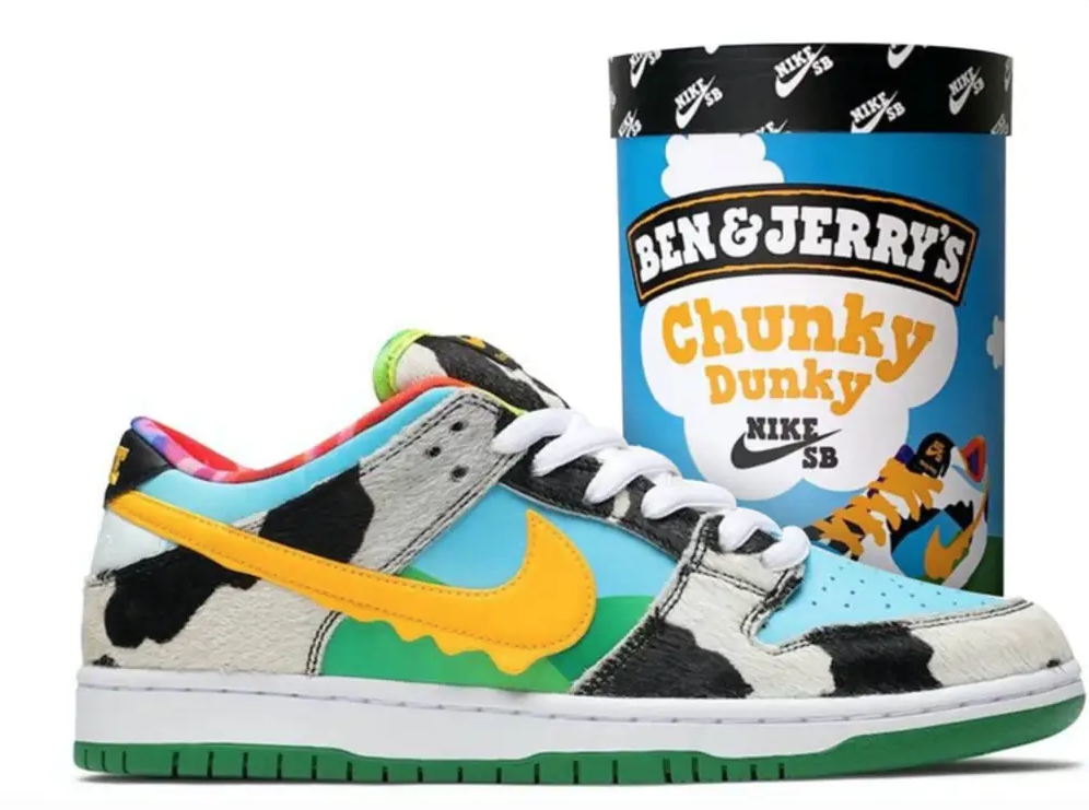
John – Nike Chunky Dunky Trainers
When I asked our resident sneaker freak what his favourite packaging was, I shouldn’t have been surprised to receive an image of a pair of Nike Chunky Dunky trainers. And before you scream “that’s not packaging,” bear with me…
Firstly, the inspiration may have came straight from a pot of Chunky Monkey flavour ice cream, but the resulting kicks are testament to the strength of the visual brand assets on Ben & Jerry’s packaging. The signature design elements are all still there; the blue skies, cows, green grass and tie-dye are recognisable enough that they transfer successfully to sneakers, while reminding us of the ice cream brand. And to further blend the partnership, the mad mix-up of colour is topped off with a yellow Nike swoosh resembling melting ice cream.
Secondly, the sneaker packaging itself works. If you were lucky enough to get a pair (they sold out almost instantly) you’d have received them in a giant ice cream tub, complete with a giant yellow ice cream scoop/shoe horn. These kicks are childish and irreverent, but they’re fun.
Inside the shoe the ice cream maker’s motif reads: “If it’s not fun, why do it?”
Sneaker fans raged when they discovered the limited run and four-figure resale prices, but judging by the next-level hype that surrounded the shoes, the collaboration was a stroke of genius.
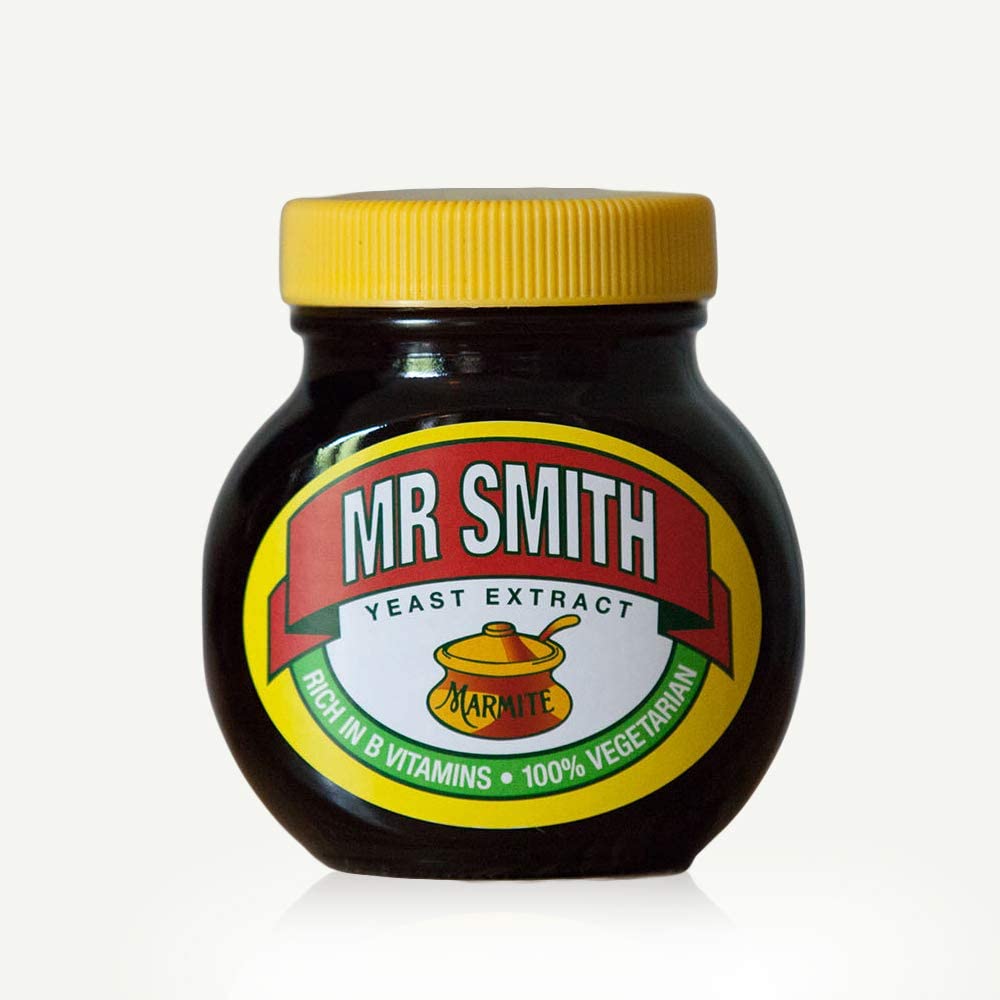
Dan – Marmite
Marmite’s distinctive bulbous brown glass jar has it all. A bit of heritage, bold primary colours and a simple name badge that stands off pack well.
“When you can hide a brand’s logo and the product is still recognisable, you know you’re onto a winner.”
The jar first appeared in the 1920’s and has retained its strong identity throughout the generations. In 2007, a rare concession to the 21st century was made with the introduction of squeezable bottles. Marmite were smart enough to mimic the classic jar shape so the new packs continued the brand legacy. Judging by the lack of squeezable options in stores, it seems shoppers still prefer the jar, even though it’s tricky to get to that last bit of product.
You’ve heard the phrase ‘You either love it or hate it.’ Well marmite provided the perfect gift for the ‘lover’ in your life, when they personalised jars. Personalisation goes straight to the veins, grabbing attention and engaging in a way that nothing else can. Marketers have been using it for years on direct mail and email communications, but it took a while for personalised packaging to be considered worth the investment and potential wastage, although, it can work. Coca-cola’s “Share a Coke” campaign saw UK sales increase by 2.75%.
Marmite launched their personalised jar campaign by giving people with the “most comical” names in Britain a jar first; Jo King, Terry Bull, Iona Wolff, Tim Burr, Holly Wood and Jim Hall all received a personalised jar.
Tony – Sustainable packaging
Our Creative Director’s response to “an example of great packaging” was, “Newspaper around my fish and chips.” For a minute he had me; newspaper isn’t necessarily the most hygienic way to protect a food product and you can’t recycle oily paper in most local waste schemes. But for Tony it’s the perfect example of upcycling, and years ahead of the recycling and sustainable practices we commonly see around us today.
“We can’t mention packaging without acknowledging that a lot of it is unnecessary, with some of it having a very negative impact on the environment.”
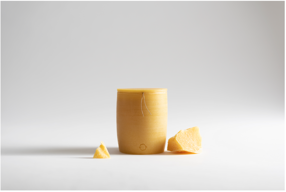
With that in mind, I want to mention Bee Loop. Their organic honey pots are the perfect example of zero waste packaging. Designed by Lithuanian designer Aurimas Kadzevičius for AK Bees Farm, the pots won two D&AD Yellow Pencil awards and Adobe’s Sustainable Design of the Year 2021.
The pots, consist of just two ingredients: 100% organic beeswax taken from the hive when the honey is extracted, and organic linen from which the honey pot opener is made. This makes them organic, recyclable, renewable, edible, biodegradable, anti-fungal, antiviral, antiseptic and antibacterial.
Sustainability is already a hot topic in packaging design and rightfully so. We’re seeing more refillable packs and concentrated products along with shrinking pack sizes. But despite efforts to reduce packaging, it’s a necessary evil that we can’t do without. We all have an ongoing responsibility to implement the use of sustainable practices and materials, while actively reducing waste and our brands’ carbon footprints.
Want to read more? You might find these articles interesting:
Great design is simple
Is your CSR strategy right for your audience?
Brands by the people for the people
Hip Hips, Huffy Bear and craft ale branding