The psychology of colour in branding

Does colour really matter?
Subconsciously colour makes us feel things. It can change our mood, and it can persuade us, so there’s no wonder that the science of colour psychology has become so important in building brands and marketing.
But is it really relevant or is it just a trope to be banded about?
Who says pink is for girls?
Colour can be a deciding factor in the decisions we make as consumers, driving our interactions. But we don’t always respond in the same way. We all have an individual emotional response to colour, but our personal experiences, personal preferences and cultural differences can change how we see colour, as well as the effect it has on us. For instance; in England we see black as serious, respectable and suitable for funerals. In China they wear yellow to honour their dead.
So if the emotional attachment to colour is subjective, is colour psychology rubbish?
Well, no. There are often commonalities in how we see colour and the associations we make. These commonalities matter. If we feel a mismatch with the emotion felt when we see a product, compared to the message it sells, we won’t trust that brand or want to engage with it. It just won’t feel right.
Understanding a customer’s reaction to the appropriateness of a colour is the most important thing, which is why researching your market is vital.
Is blue really for banking?
Blue – seen as trustworthy, honest and traditional; it should be right for a new bank, shouldn’t it?
A brand’s personality and goals are more important than the existing market sector or product associations. Understanding the personality, audience and goals as well as the environment and customer touchpoints, are essential when choosing an appropriate colour palette.
So, even though blue is traditionally the colour of banking, if you’re a bold, new challenger bank or a bank that does things differently, traditional blue may not be the best primary colour choice.
And that’s why we don’t consciously use colour pyschology during our creative process on brand development projects.
Brands that break the rules
Take First Direct. They chose black as their primary colour. It marks them out as different and cuts out all unnecessary distractions from their content, which itself stands out as being irreverent and fresh.

What if you want to stand out from the crowd. Or if all your competitors are a sea of blue? In a saturated market it can be hard for a brand to ‘own’ a colour.
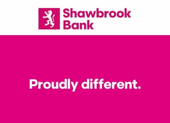
Shawbrook Bank’s primary colour is bright Magenta – a colour for the spirited, the imaginative and the modern. In a bid to gain market share, they want to be known as ‘proudly different’, whilst getting noticed.

Pick a colour that is totally different to the competition to stand out. But unless it is an authentic colour which truly represents your brand personality and business’ goals, it may fail to engage.
A logo is not a brand
A brand needs considering at the point of which we engage with it. So if it’s fast food, the most noticeable brand communication may be in the french fry packaging. McDonalds may be perceived as a red brand rather than the yellow of its logo because there is more red to see. Morrisons may be seen as a green brand – there is yellow in its logo too – because the shopfront is mostly a ‘vegetable green’.

We developed the Remeha brand using yellow as the predominant colour but the dominant colour on all collateral is black, which positions the world-leading boiler manufacturer as a high quality brand with premium products.

How big brands influence our colour associations
“69% of three year olds can recognise the golden arches of McDonalds.” Source: The Guardian
When a brand becomes so well recognised, other brands often jump onto the tails of the dominant brand’s success and adopt similar colourways. This can reinforce a colour association such as in the fast food market, which is dominated by red. McDonalds, KFC and Littlechef, all marry their brand palettes to the colour psychology traits; energy and activity.
But the biggest brands can also shape our view of a colour over time, shifting associations, especially when a brand adopts a ‘stand out’ colour such as Apple adopting white, shifting that particular colour from being seen as affordable to high end.

A yellow giant in the construction industry
Despite yellow being a ‘fun, friendly and optimistic’ colour and brown being ‘earthy, masculine and rugged’, the construction sector is dominated by yellow. From tools to heavy machinery, the big brands are bright sunshine yellow from CAT to JCB, Stilh and Dewalt – and for good reason. Context is just as important as general colour associations. For instance, yellow stands out on a messy building site, which is why builders wear high visibility vests and bright helmets. Bright colours can help equipment to be seen too, so moving machinery is often red, orange or yellow.
We developed the Buildr brand, a concrete delivery app aimed at the trade industry. We decided on following the construction-biased yellow theme to create a brand that would feel instantly familiar. The app was developed to help change the way builders work on site, saving money, time and hassle.

Colour by brand
These are some common definitions of colour psychology and brands which have adopted them:
• Red — Passion, energy, excitement and anger. Bold, active and youthful. It signifies importance and commands attention.

• Orange — Cheerful, playful, vital and friendly. It’s warm and evokes energy. It can signify affordability.

• Yellow — Fun, happy, youthful and optimistic. We notice yellow first, so it’s great for grabbing attention or expressing value.

• Green — Stable, prosperous. It represents growth and a connection to nature.

• Blue — Trusted, open, calm, honest and caring. It stands for leadership, dependability, professionalism and security.

• Purple — Regal, rich, luxurious, creative and nostalgic.

Final thoughts
While it’s tempting to use colour as a means to distinguish your brand from the crowd of competitors, always bring decisions back to your brand personality and goals, and the customer touch points. It can be easy to get wrong – ultimately damaging your brand equity. Get it right however, and it can truly set you apart and become a recognisable and ownable element of your overall brand identity.
If you’d like help with brand creation or brand development, get in touch, we’d love to help. Alternatively for the latest branding and design news, head on over to our Articles page.